Visualizing weather information in Power BI with data from Microsoft OMS
Summary: Use Power BI to visualize weather information.
The previous part of this blog post showcased how weather information could be visualized in Microsoft OMS using queries, My Dashboard, and a custom solution. In this blog post, we will look at how we can route this data to Power BI and utilize Power BI to visualize this information. In this blog post, we will explain how to export data from OMS to Excel and Power BI, including steps to enable the Power BI Integration.
Export data from OMS to csv and Excel
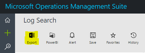
OMS includes a built-in ability to export any data that you query to a csv file that can be viewed through several applications including Microsoft Excel. To do this, just open a query, and choose the Export button.
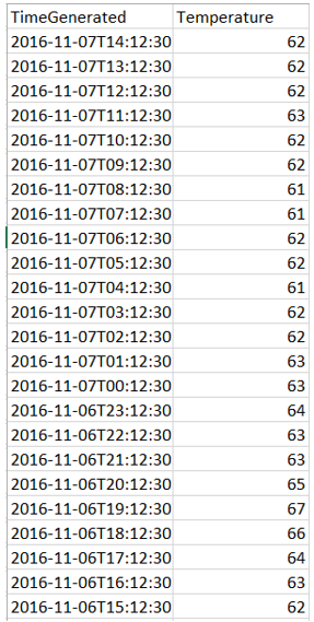
This saves the result to a csv file that opens automatically in Excel. After you have the data, you can filter it and graph it. The data appears as we would expect and can be filtered. The subset in the following screenshot shows temperature information for only one location.
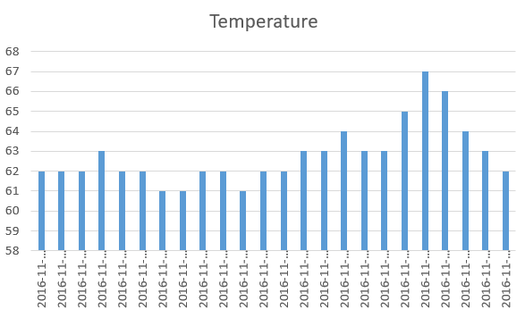
You can create graphs based on the information just like you can do with any type of data in Excel.
Configure OMS to export to Power BI
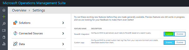
Currently, Power BI Integration is a preview feature in Microsoft OMS. To enable this in your workspace, go to the Settings tab, and then enable the preview feature.
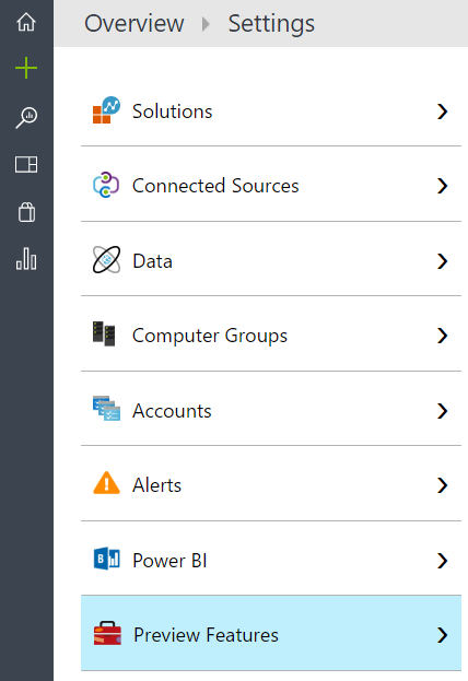
When you open the Preview Features area, you can enable or disable various OMS features that are currently in preview.
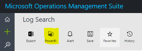
After this feature is enabled, you will see the option to export data to Power BI, as shown in the following screenshot, with the other built-in log search options (Export, Alert, Save, Favorites, and History).
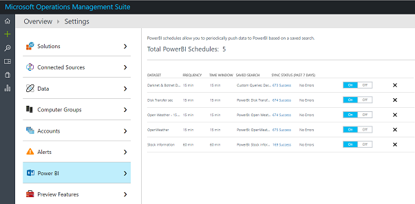
Current Power BI exports are available on the Settings tab under Power BI where you can turn on, turn off, or remove exports.
Visualize OMS data in Power BI
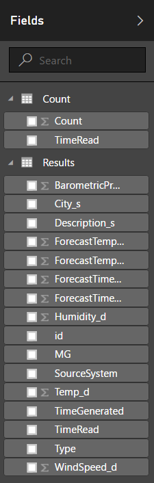
After you export the data from Microsoft OMS, data will appear based on the frequency that you specified when you created the export within the Datasets area.

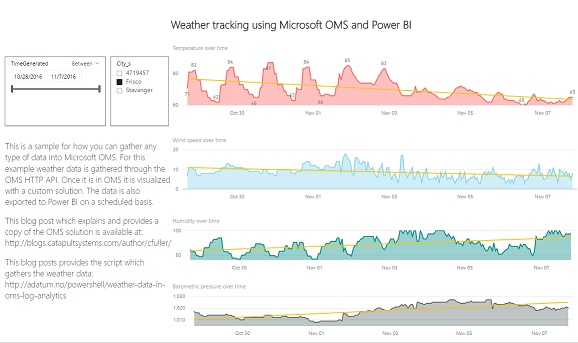
An example of this is shown in the following screenshot.

To determine whether your data is populating, see the right side of Power BI under Fields. The results section should show each of the fields that were exported.
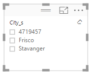
As a hint, start with the slicer visualization.

Add one of the easy values, such as the City, to visualize.
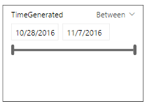
This example also adds a slider for the TimeGenerated field.
After you have the slicer populated, add the Area charts for the various values (Temperature, Humidity, etc). Finally, add the text to the left and the title to the top. After a bit of cleanup, the final result looks like this!
Summary: Power BI provides an incredible method to visualize data, including data from Microsoft OMS. Because we can now route whatever type of data we are interested in to OMS, we can visualize any of this data in Power BI as well.
Cameron Fuller
Catapult Systems