The Evolution of “Smart Scheduling” in Outlook 2007 – Part 2
Part 2: When we last left our superheroes (see Part 1) -- the Exchange Mailbox IW team -- they were still iterating through potential scheduling form designs to come up with the final plan. (Click on all the images below to see the full size version).
Round 3 – The return of free/busy!
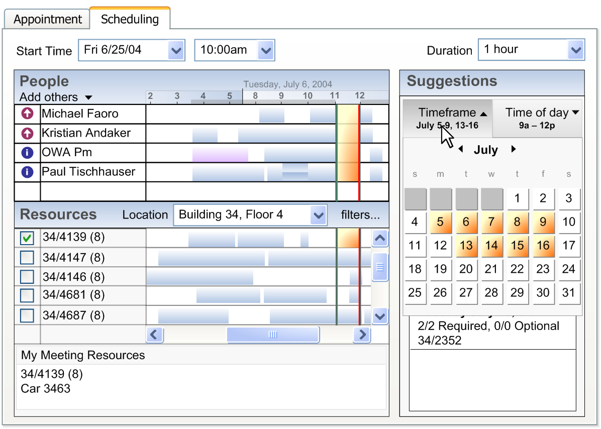
This design starts to get much closer to the final plan. After putting a number of the other designs in front of real users (yes, we actually do this sometimes), they told us loud and clear: we like the meeting suggestions as 'helpful hints', but we still want to see the free/busy. Basically, in order to get users to trust the new suggestions, we also had to give them a view of the original data (free/busy) so they could double-check that we were making smart suggestions. This lead us to the first view that integrated free/busy and meeting suggestions on the same tab.
There are a couple of other things to point out about this design:
- In this design, the "People" section and "Resources" section were split, and overall people preferred this design. It makes a lot of sense because users think about scheduling people differently than they think about scheduling rooms. We were able to get this "split grid" design into OWA (because it was being re-written anyway) but unfortunately weren't able to get it into Outlook due to time constraints.
- The "Location" drop down for Rooms, in this design, is something we should revisit in the future. The idea here was that you could quickly select a location and all of the rooms in that location would be added to your scheduling form (so that one free one could be chosen). We didn't end up getting a completely robust concept of 'location' built into the system, so this got dropped. However, OWA retained part of the concept in the final version with the ability to easily add all 'recently used' rooms.
- In "Round 2", the timeframe for the meeting suggestions was set through a dropdown; in this design, we introduced a calendar control that would pop up in front of the meeting suggestions when you clicked on the tab above it. The idea of the calendar control was that you could select one-by-one individual days that were 'ok' for you to meet in – so that the system would only provide suggestions during those particular days. The orange days you selected were the ones that you wanted suggestions generated for. The other interesting control in this design was a "Time of Day" filter (not shown active). If you clicked on "Time of day", a different control would be shown that would enable you to filter which particular hours of the day you'd like to have the meeting. The "Time of Day" plus "Timeframe" controls together would serve to filter the meeting suggestions that were returned.
Round 4 – Remove the 'time of day' and 'timeframe' controls
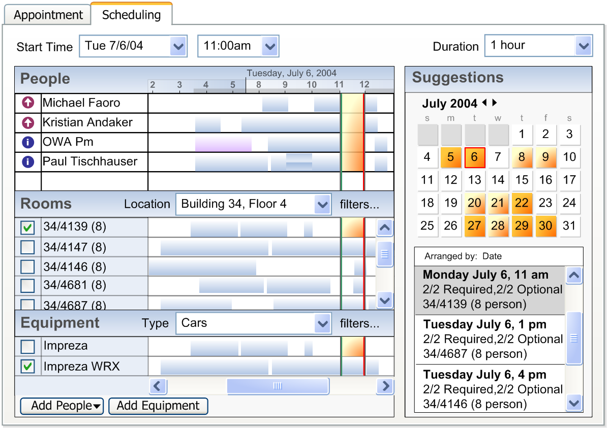
At some point, it dawned on us that instead of using the calendar control as a way for the user to filter results, that there were better ways to use it:
- The calendar control could be used to navigate the free/busy grid. One problem we heard and observed when we had talked to users is that it was quite easy for users to get "lost" in the free/busy grid and lose track of which day they were actually viewing. They didn't have an easy way to move around in the grid. We thought the calendar control could be used by the user as a free/busy navigation aid, and it turned out that worked quite well. This made it into the final version.
- In "Round 3", we were asking the user for a lot of input – like the timeframe of the meeting, and their preferred meeting time. Although this allowed for discrete control over the meeting suggestions that were returned, it wasn't clear that the benefits outweighed the cost of asking the user for more information. For one, instead of asking the user for the 'time of day' that they preferred the meeting, we could simply use the working hours already configured in Outlook. And instead of making them choose which days they wanted to potentially meet, we could just show them all the days and then color the ones that were better days for meeting vs. others.
This form also shows equipment called out as a separate row on the scheduling tab. This didn't make it into the final design – and improving equipment scheduling is something we should think about tackling in future releases. [The more I work in this area the more I am convinced there is so much for us to do still. Email and scheduling are far from being 'done'].
Round 5 – Prototype
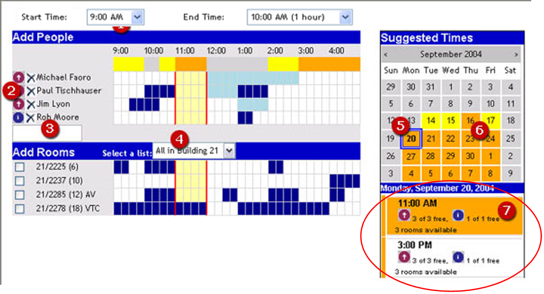
This is one part of the effort that I'm personally proud of – and also helps to show how it is useful for Program Managers to be able to code up something every once in a while. Before we made the final no/no-go decision on building the feature in Outlook and Outlook Web Access, it was important to see the interaction "in action" to get a feel for how – and if – it could work. I built a prototype in ASP.NET of the design which – except for formatting – you can see looks very similar to the final design in Outlook Web Access. Since we were NOT part of either the Outlook or Outlook Web Access teams, building this prototype helped us have something we could show to them to prove its feasibility.
Round 6 – Final design
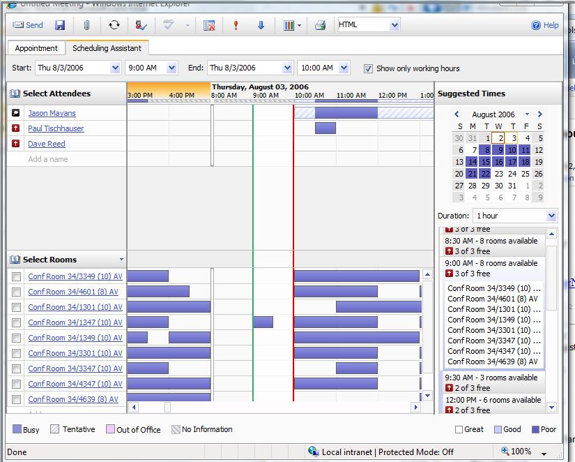
This is a screen shot of what it finally ended up looking like in Outlook Web Access. (Outlook looks very similar, except attendees and rooms are not in separate sections of the free/busy grid). In this example, I can see that August 8th-22nd are not good days to try to meet with these two other people but other days in August should work fine. I've also added a bunch of potential conference rooms to the form. By doing this, I can click on one of the meeting suggestions on the right – and choose a particular conference room. (No longer do you have to add a bunch of conference rooms, find the one that is free, and then delete the rest off – if you use the suggested times list, this gets taken care of for you).
In fact, the system works best when you intentionally add multiple conference rooms to the form. This way, the suggestions can tell you which room is free for that particular time and select it for you if you click on that suggestion. Intentionally adding multiple conference rooms to the form is a change that users should make to get the most out of this form.
Conclusion
I hope this was an interesting look into how one particular feature got built in Exchange 2007. If you have ideas on how we can improve the scheduling process even more in future releases, leave me some comments. We should also be posting a video walk-through some time with the PM for the feature (we've already filmed it).