The Evolution of “Smart Scheduling” in Outlook 2007 – Part 1
One of the features that my team is especially proud of for Exchange & Outlook 2007 is the new "Scheduling Assistant" that is in Outlook Web Access and Outlook 2007. If you want to see a live demo of this functionality (and all of Exchange 2007 calendaring) you should take a look at this TechNet Webcast that Paul Tischhauser, PM for the feature, did. Anyway, I thought it might be interesting to talk a little bit about how this feature evolved over time – starting from an idea to its development & completion.
Purpose of the "Scheduling Assistant"
We knew that calendaring was going to be one of our major points of investment in Exchange 2007. In the fall of 2003 and spring of 2004, we visited a number of companies to observe information workers, learn their pain points, and find out how they interacted with the product. One of the things that kept coming back to us was that – calendaring was too difficult, it takes too long to set up a meeting, and nothing has improved in Outlook in this area since it was first shipped. Since our team was tasked with making Exchange 2007 the best server for Outlook users, we wanted to figure out what we could do – across both server and client – to improve this experience.
We knew, from experience and from talking to users, that the "AutoPick Next" functionality in Outlook 2003 really wasn't that useful for scheduling meetings. For people that had busy schedules, and were trying to schedule a meeting within the next week or two, using this button would certainly find a time for the meeting – but it would be three months away. We wanted to figure out the right way of balancing all of the various inputs and requirements that go into meeting scheduling, including:
- The "importance" of various attendees – the Executive VP is really required, but if Jon the Intern can't make it, that's ok. (On the other hand, for Jon the Intern's going-away party, the VP isn't really required – but Jon is).
- Requirements around conference room booking – location, capacity, available equipment (PolyCom phone, Ethernet port), permission to book, availability of the room, etc.
- The time frame of the meeting – often a meeting next week that 75% of the people can attend is more valuable than a meeting in 3 months that everyone can make
So we started brainstorming on various ideas around how to simplify the scheduling experience, and put together some prototypes. I was originally a big fan of doing something similar to the flexible search options found at Orbitz. (I like how they let you be specific, yet flexible, about your requirements – and how they present search results in a very powerful way. Three years later, I still think it is the best airline search out there). In the end, we went a different direction – based on user feedback – and came up with a design that enables users to slowly transition into a new way of thinking about scheduling without taking away what they like about the current design.
Round 1 – Conference Room search & Booking
Paul and I worked closely with one of the excellent members of our design team, Michael, to come up with some prototype ideas to test in front of users. For one of the first iterations of our design, we looked just at the issue of booking a conference room. First you would enter in the criteria for your conference room. This could include things like equipment you needed, the building the conference room was in, and the timeframe that you needed this in. Then, you would get back search results that would show you available time slots, and a drop-down list of rooms to choose from that were available at that time. We knew that some conference rooms will always require approval before booking them, so we wanted to also include that information in the results list. This is what that looked like (click on it for full detail):
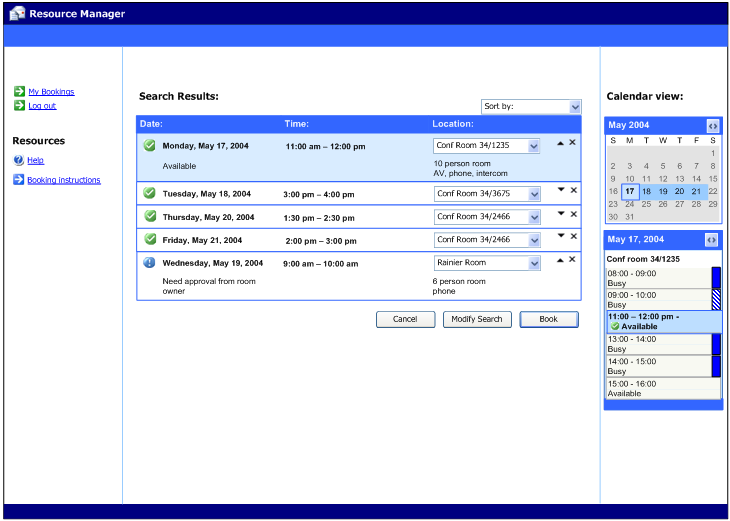
This produced what I still think is some nice looking UI, but there were really two problems with this design:
- It wasn't integrated into the Outlook booking process – this was designed almost as a stand-alone app and didn't fit well into Outlook's meeting request form & model.
- It put scheduling resources (conference rooms) before scheduling people. As we found out, that isn't really how people work. Users tend to find a time that everyone (or most everyone) can meet first, then they find a conference room. But the most important thing is the people, not the room.
Round 2 – Integrated into Outlook; People AND Resources are important
This next design shows integration into Outlook – as a new tab on the meeting form called "Smart Scheduling." (The "tab" design was before Outlook had implemented the "Ribbon"). In this design, you still specified your search criteria explicitly for your meeting. You could provide "flexible" or "specific" search criteria (my influence from liking Orbitz) for both the time of your meeting as well as the resources required for your meeting. I still kind of like this design, although it would have been more complex than our final implementation. Here is the first time you see the meeting options listed on the right-hand side in a format that is fairly close to what we ended up with. (Click on image for full detail).
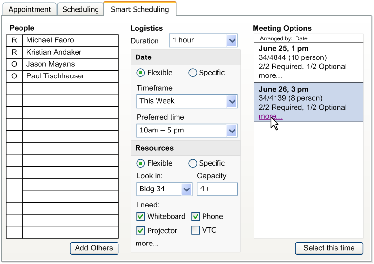
We tested this type of design in front of users, but the feedback we got is that they missed seeing the individual attendee's free/busy, like they could in the normal scheduling tab. Although users appreciated our meeting options as a quicker way to find a good time to meet, they weren't comfortable with it unless they got to "see the data themselves" to confirm that our "smart" suggestions were really doing the right thing.
This is when we determined we needed to figure out a way to deliver the best of both worlds – in a way that enabled users to slowly transition from their current free/busy-based way of picking meeting times to using our new model.
I'll talk about how this continued to evolve in a subsequent post…