Guest Post: Top Tips from QA - Creating business diagrams from within SQL Server without using Visio services or third party tools
 Mark ‘Fitz’ Fitzgerald is the principle technologist for business intelligence, covering SQL, PerformancePoint and ProClarity at QA . He is a twenty-year veteran of the IT industry, with experience that ranges from mainframes, help desk and MIS systems. Mark has experience developing business applications in a range of products which enhance and distribute accurate, timely information within organisations. Mark has been with QA since 2000, and in 2003 & 2006 he won QA’s Trainer of the Year Award. Mark’s enthusiasm knows no bounds and training sessions often spill into breaks, lunch times and early evenings if not interrupted!
Business Diagrams using SSRS Map Control
Many businesses need to be able to produce business-oriented diagrams using SQL Server data. This can pose a problem for the SQL Server user, many of whom rely on Visio services or third party tools to be able to produce the reports which the business demands.
However, it is possible to use spatial maps within the reporting services element of Microsoft SQL Server 2008 R2, to create diagrams for use within business reports – whether this is from data stored in SQL Server as geometry/geography data types, embedded within the control itself (US only) or by using an ESRI shapefile. The diagrams below illustrate the level of reporting capability possible using this technique. All of the diagrams below are calculated from a standard parent and child relational source.
 Below is a list of types of diagrams typically requested by the business:
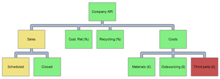
- Hierarchies : a simple parent and child hierarchy, allowing for multiple root members, colouring of the boxes (to show seniority or performance), naming of the boxes and providing tooltips
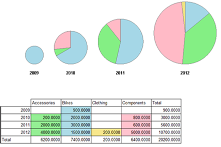
- Multiple proportional pie charts : changing the size of the charts for successive periods to show growth or shrinkage, maintaining the essence of the proportions for each segment
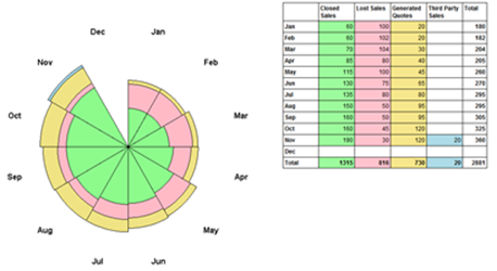
- Nightingale Rose: similar in design to a pie chart combined with a stacked bar. The segments around the chart are evenly spaced, but the radius of the segment changes and are proportional to the values shown
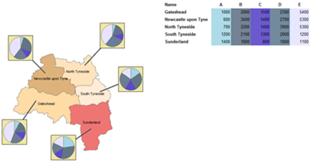
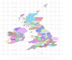
- Extending maps with Sparklines: taking a geometric map (such as that above, based upon UK Ordnance Survey data using eastings and northings) as a base, sparklines charts can be added with links to the geometric shapes.
- Networks: a simple diagram showing objects (tasks, stages, people) and the flows between them. This could be a workflow, a rail network or sites to specific network links
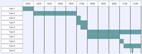
- Gantt charts: although not a replacement for project management software and professional diagrams, a Gantt can be produced using geometry shapes
Making these available using SSRS will allow clients to visualise the data better and give the developers additional options for display. It is not likely to replace the common chart types available within the product, but with a little thought and effort most diagrams are possible.
All of the diagrams below are possible using standard TSQL objects (user defined table data types, user defined functions and stored procedures). No CLRs are used in creating the diagrams and each performs adequately.
Useful Links
- Download SQL Server 2012
- SQL Server Product Page
- TechNet Library for SQL Server 2012 (Includes Whitepapers, Documentation & Samples)
