OpsMgr 2007: Performance Reporting scale values may not plot as expected
We get a call on this every now and then so if you're not seeing what you expect to see with any of the performance reports in System Center Operations Manager 2007 then this may be what you're running into. It's not that the data is incorrect, just that the scale values may not be what you're expecting.
To give you an example, let's say we want to view a performance report for the time period from 1:00am to 4:00am. When you view this report it may appear that the report does not show the correct times for the range we specified. Based on our report, we would expect the report to plot our data using a starting value of 1:00am and an ending value of 4:00am, but when you view the report it's actually marked as 1:00am to 3:00am. This gives the impression that we haven’t collected the data for the last one hour:
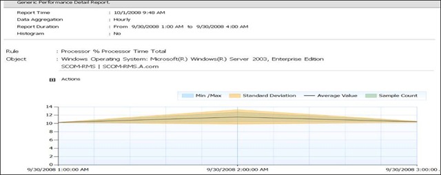
So what's going on? The reason we see this is due to the timestamp of the aggregated data. When you run a report for 1:00am to 4:00am this is actually 3 aggregation periods as shown below:
- 1:00am to 2:00am
- 2:00am to 3:00am
- 3:00am to 4:00am
Each of these periods would be time stamped in the DW as follows:
- 1:00am to 2:00am : Timestamp 1:00am
- 2:00am to 3:00am : Timestamp 2:00am
- 3:00am to 4:00am : Timestamp 3:00am
Because of that, this is what is plotted on the graph:
![clip_image001[6]](https://msdntnarchive.blob.core.windows.net/media/TNBlogsFS/BlogFileStorage/blogs_technet/smsandmom/WindowsLiveWriter/OpsMgr2007PerformanceReportingscalevalue_775C/clip_image001%5B6%5D.jpg)
So the bottom line here is that while the graph isn't necessarily plotting what you might expect, it's working the way it is supposed to.
Hopefully this sheds a little light on why you're seeing what you're seeing, and you can rest assured that the report is not broken but instead is working exactly the way it was designed to work.
J.C. Hornbeck | Manageability Knowledge Engineer