PowerBI: Visualize your data in dashboard in 10 minutes
Introduction: In this post I will showcase how to create a Power BI dashboard in 10 minutes that connects to a SharePoint list as the data source. In the previous post, PowerApps: Be a hero and transform business process, in 10 minutes (and without writing code!), I walked you through how to create a PowerApp and use it to enter data in a SharePoint list. In this post, we will take that data and present it in a Power BI dashboard to make it easier to visualize the data.
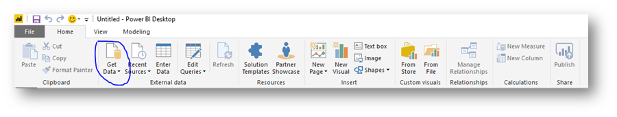
First, Download Power BI Desktop from www.powerbi.com and install it on your PC. This is required in order to connect to SharePoint Online lists. Once downloaded, launch Power BI desktop and select Get Data from the toolbar:
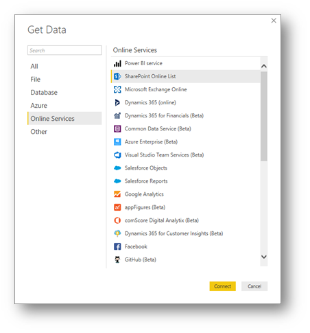
In the Get Data dialog box, click Online Services on the left, then on the right highlight SharePoint Online List and click Connect:
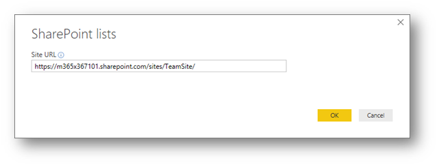
In the SharePoint Lists dialog box, type the URL of the SharePoint parent site and click OK:
Note: This is the parent URL of the site, and not the specific URL of the list you are trying to query.
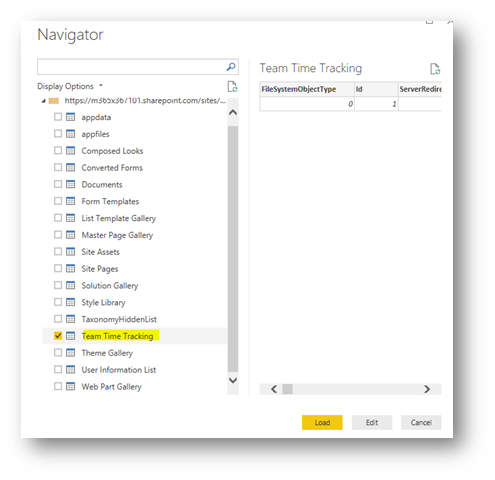
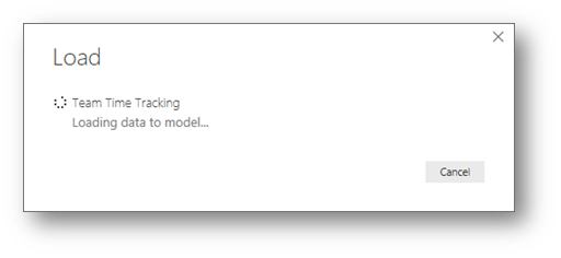
In the Navigator dialog box, on the left side place a check mark next to the list you wish to query and click Load:
The SharePoint List will be retrieved and a data model will be created in Power BI Desktop:
Once loaded, on the right side of Power BI Desktop will contain your data – specifically the columns in the SharePoint list:
Note: The data will contain columns that are also hidden on SharePoint.

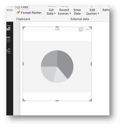
Now, let's create a simple pie chart to show how many hours are spent on each project. Click the pie chart sign  , and a new pie chart will be placed in the workspace:
On the right side, drag the columns Title to the Details field and Hours Spent to the Values field:
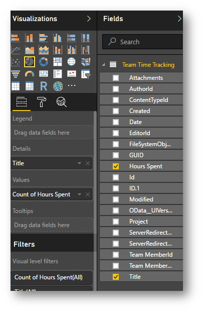
In the workspace, notice the pie chart that was created and updated in real time:

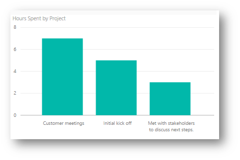
Next, create a bar chart by clicking the  icon. Drag Projectto theAxis field and drag Hours Spent to the Value field.
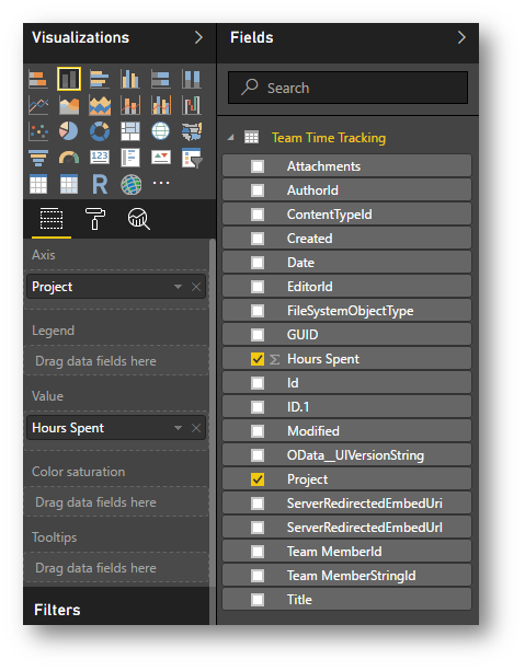
Notice the bar chart is created in real-time:
Next, on the toolbar click Publish:

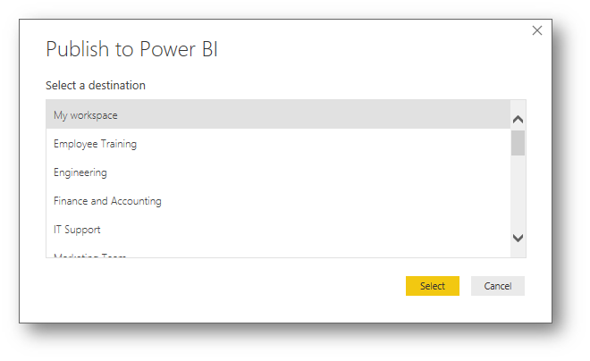
When prompted to save, save the Power BI Desktop file to your desktop and give it a name, for my example I will use Time Tracker. At the Publish to Power BI dialog box select My Workspace and click Select:
The report will now be published to Power BI, once finished open an internet browser and navigate to www.powerbi.com and sign-in: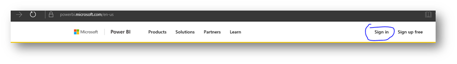
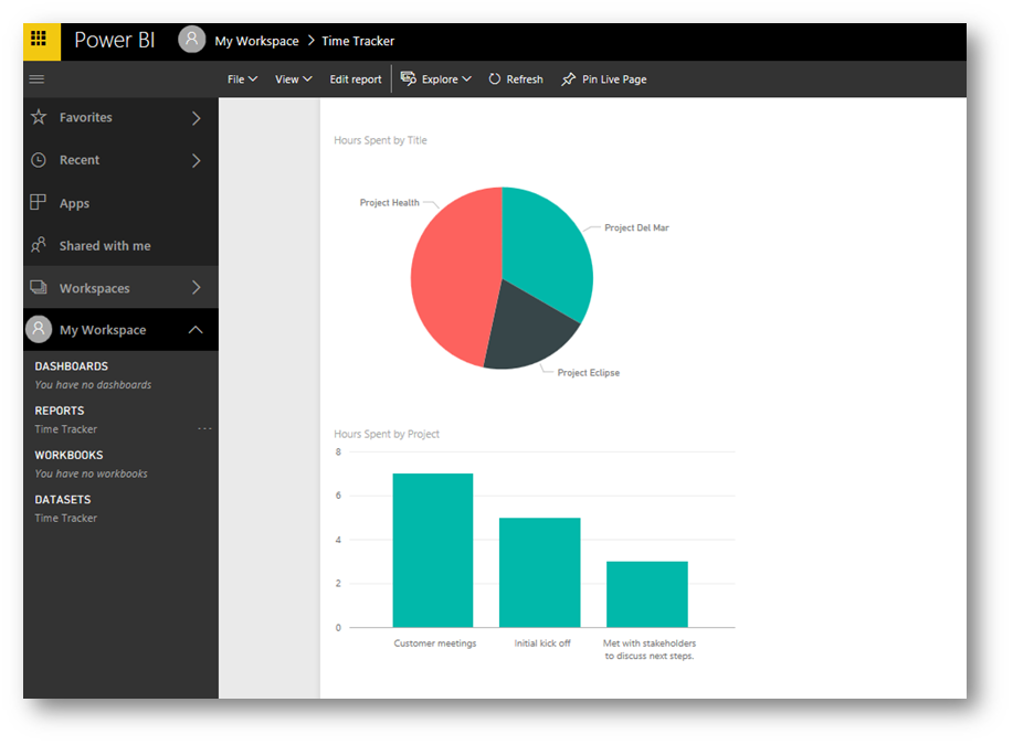
On the left side, expand My Workspace and click the report Time Tracker. This will display the report you just created in Power BI Desktop:
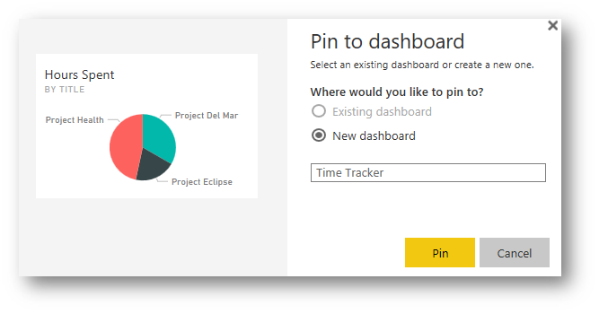
To create a dashboard based on this report, hover the mouse cursor over the pie chart and click the  (thumb tack icon). At the Pin to Dashboard dialog box, in the New dashboard field type a name (for this example I will use Time Tracker) and click Pin:
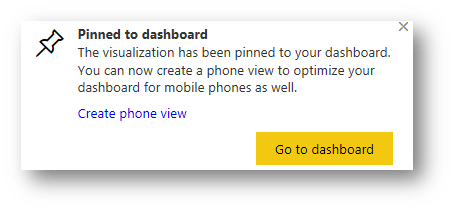
This will create a new dashboard and a toast notification will appear, close the message:
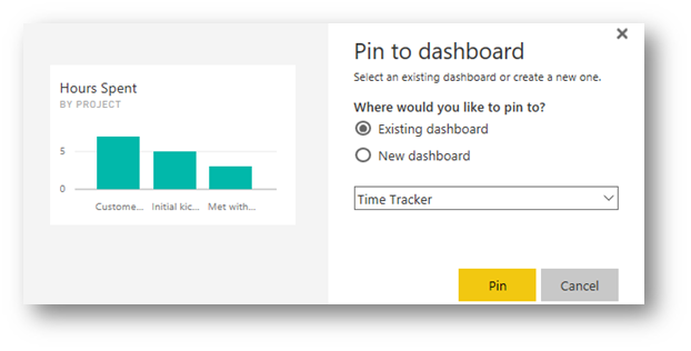
Repeat the above steps for the bar chart. Hover the mouse cursor over the bar chart and click the  (thumb tack icon). At the Pin to Dashboard dialog box, in the select Existing Dashboard ensure Time Tracker is selected and click Pin:
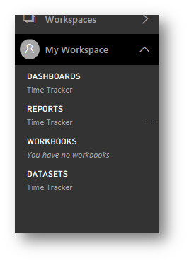
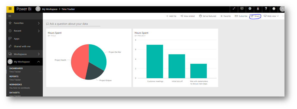
Next on the left side, click Time Tracker underneath Dashboards to access the dashboard that was just created:
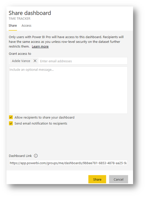
This will display the dashboard. Click Share at the top right corner
In the Share dashboard flyout on the right side, in the Grant access to field type the name of a user and select that user. Then click Share:
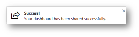
A new toast notification will appear indicating the dashboard has been successfully shared:
The user will receive the following email message, giving them a link to access the dashboard:

IMPORTANT: This dashboard can also be accessed using the Power BI smartphone app.
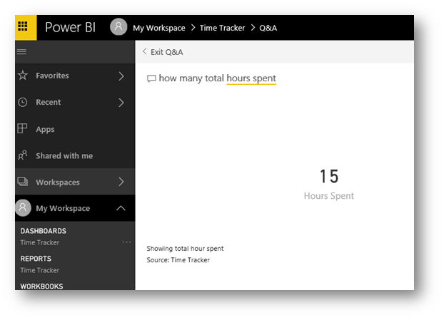
For fun, let's use the natural language Q&A to ask a question about the data. On the dashboard page, in the Ask a Question about your data field type how many totals hours spent and press Enter. In real-time the sum of the total number of hours will be shown:
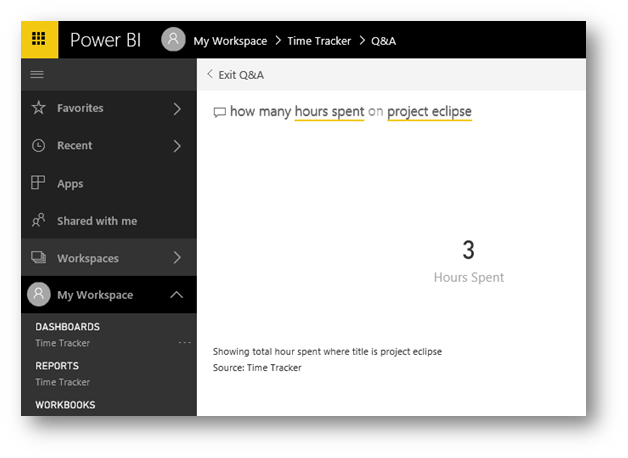
Let's ask another question, repeating the step above ask how many hours spent on project eclipse:
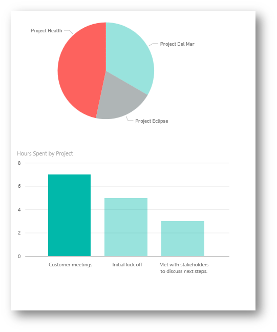
Click Exit Q&A. Click on the pie chart, the report view will open. Click the red area of the pie chart. Notice how in real-time the data is filtered on both the pie and bar charts to reflect filtering on Project Health:
Conclusion: As you can see, it's relatively straightforward, fast and easy to connect to your SharePoint list and create powerful visualizations of your data and share with others using PowerBI.
As always, if you have feedback, comments on this post or ideas for future posts please let me know in the comments below. Also, I would love to hear how you are using PowerApps, SharePoint and PowerBI to digitally transform and create new scenarios.