Creating your own custom icons for Orchestrator activities
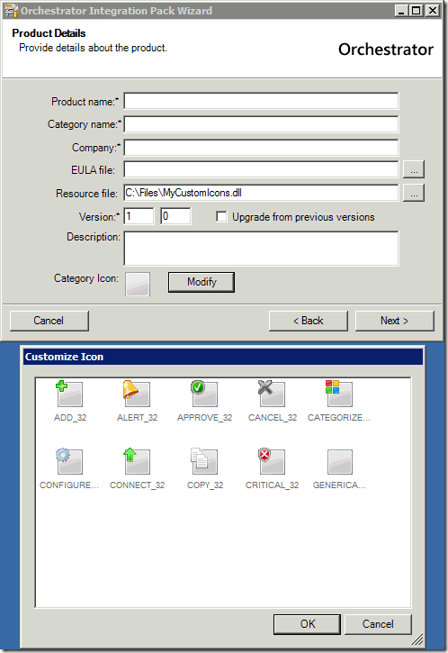
One key to a professional-looking Integration Pack is a set of customized icons for the IP category and its activities. When you create a new IP, you can select a different resource file to specify the category icon and the icons of all the individual activities. I’m sure a lot of people (like me) have tried using other assembly files that are resource files for other applications. You know they store the icons for that product, and you can actually use those icons in things like shortcuts for Windows, so why don’t they show up when you try to use them with Orchestrator? Well, there are a couple of reasons, but suffice it to say that if you want custom icons, you need to build your own resource file. The good news is that it’s actually pretty easy, and I’ll show you how right now!
Creating Icon Graphics
To create icons, you start with a set of bitmap (.BMP) files representing the icons you want. Each icon needed for the IP and activities needs to be supplied in two sizes: 16x16 and 32x32. You can use your favorite graphics editor (I use Photoshop Elements) to create the icons, just follow these guidelines:
- The transparency color for Orchestrator icons is black (0,0,0). If your icons contain black that is not intended to be transparent, you should change those areas to near-black (15,15,15). Visually, these will still appear to be black but will not be rendered as transparent. This is a key difference between Orchestrator and other products that typically use magenta as their transparency color. Don’t ask me why it was set to black… it just is :)
- You should not use a colored background (white or otherwise). Colored backgrounds may reproduce well with one certain desktop color, but may not reproduce well on other backgrounds. Your icon needs to be “portable” across different aspects of the product, so transparent backgrounds are better.
- Do not use text in an icon, since your IP may be used in many different locales, and putting words in graphics prevents localization.
- Try to utilize the same “verb” and “noun” graphics that other activities use for the same type of actions. Consistency across activities is a key customer benefit and helps them understand what your activities do just by looking at them.
- If your activities represent a theme, or perform actions with a specific product, it’s ok to have a “theme” for your icons. That may be a consistent “noun” icon that represents the product, or it might be a product logo (make sure you have rights to use it and it displays well at 32x32 and 16x16), or it might be a colored base icon (see the new generic activity icons in the Integration Toolkit for examples).
- Be sure to check out how your icons look once they’ve been implemented to check for any fuzziness (which can happen around shading and transparency edges), and fine tune them as needed.
Creating the Resource Assembly
The assembly used for icons is a C++ Win32 assembly. To create the assembly, you create a new Win32 project using Visual Studio, using the following process:
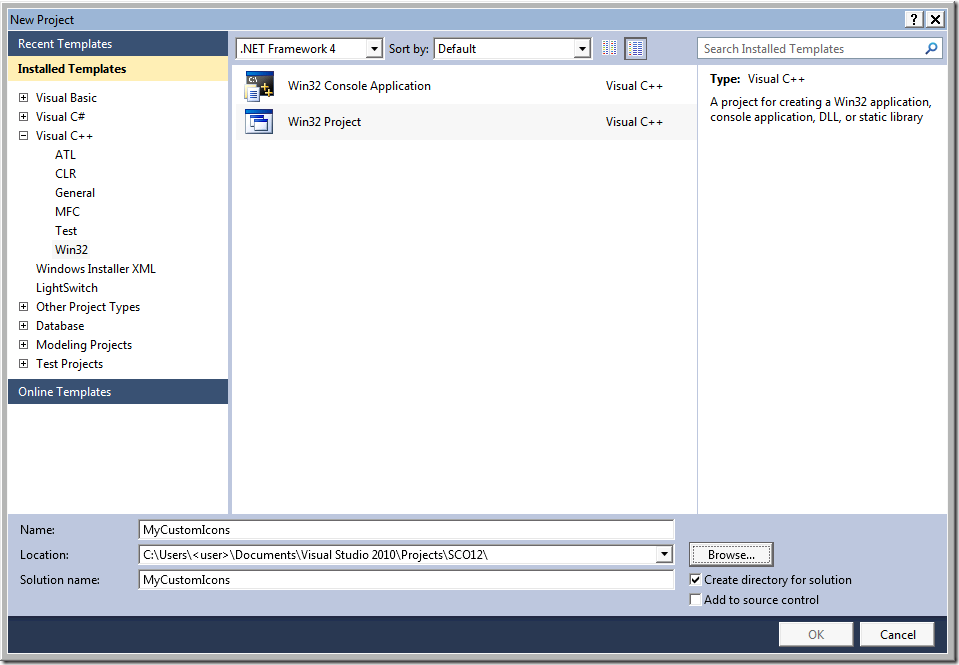
In Visual Studio, click on File > New > Project. This opens the New Project dialog.
Select the Visual C++ > Win32 template category in the left pane. Select Win32 Project as the project type in the center pane, and set the .NET Framework version to .NET Framework 4.
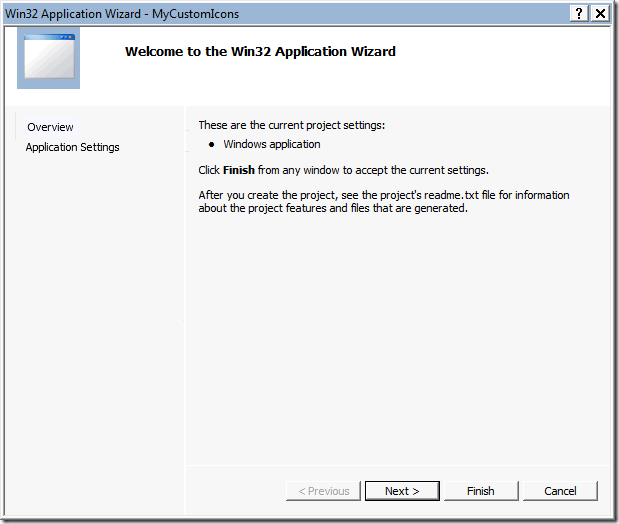
Provide a project name and path and click OK. The Win32 Application Wizard launches.
Click Next on the first page of the Wizard.
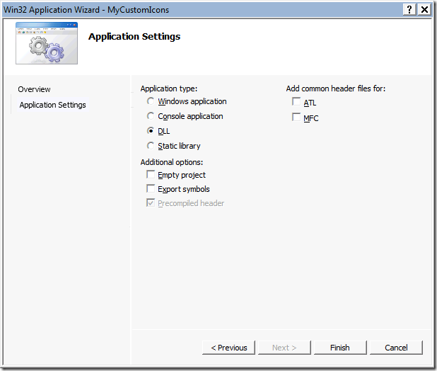
On the Application Settings page, select DLL under Application Type, then click Finish. The C++ project is created.
Using Windows Explorer, add a folder named Resources under the project directory and copy into that folder all of the BMP files you want to use as icons.
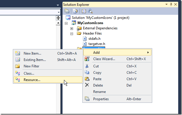
In Visual Studio, within Solution Explorer, right-click on the Resource Files folder of the project and select Add > Resource.
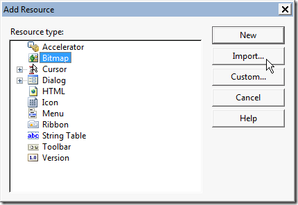
Select Bitmap and then click the Import button.
Browse to the Resources folder you created in step 6, select all of the BMP files and click Open. The bitmap files are added to the Resource Files folder in the project.
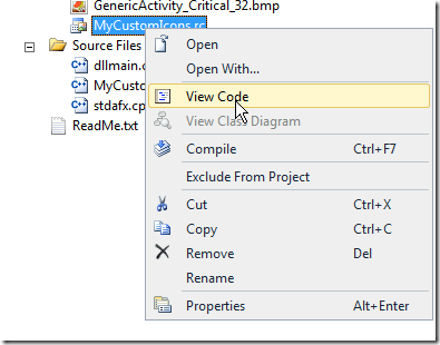
Right-click on the <project name>.rc file located in the Resource Files folder and select View code. The .rc file opens.
Modify the identifiers of all the bitmaps so that they end in “_16” or “_32” corresponding to the bitmap sizes. The content should appear similar to the section shown below.
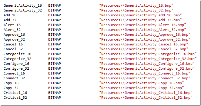
NOTE: You must rename the identifiers this way or the icons will not be found and displayed by Orchestrator.Save your changes to the project and build it. The .DLL file created can now be used as a replacement resource file for your Integration Pack. Just specify your new assembly and you’ll have access to the custom icons.
Using this process, you can create unique, custom icons for your Integration Packs and make them look more professional and stand out from other activities. As part of the Orchestrator release. I will post a set of “icon building blocks” that you can use to create custom icons using standard “verb” icons with base graphics and just add your own “noun” graphics. Look for that out on the Orchestrator CodePlex site (https://orchestrator.codeplex.com)
Enjoy!
