How are OpsMgr 2012 Dashboards different from Reports?
While reports are a good way to get data specific for a certain time period, customers like you wanted a way a rich way to visualize data which you could then project and share with your organization.
In OpsMgr 2012, we introduced the concept of Dashboards. Dashboards are familiar concept to our enterprise customers as a way to view Operational Data in a condensed, single pane of glass, which they can use to make decisions. There are various types of dashboards for various personas in an IT organization. You may have a Data Storage Manager that wants to see the percentage of SQL servers using more than the allocated amount of disk space; you may have a Systems Engineer managing a high traffic web site wanting to know what average requests per/sec are for all his IIS Web Servers. Dashboards convey information succinctly and in a compact format so that the end user can decide if they need to take action immediately.
Providing a rich UI experience for understanding health and configuration of custom and specific workloads such as SQL, Exchange or SharePoint in a single view has become very important. In OpsMgr 2012 with the in-console Dashboard authoring experience enterprises can build custom dashboards within minutes, whereas accomplishing something similar to this in a report would take days even if you are an expert.
Dashboards continue to get a lot of attention in most organizations, not just because of their visual appeal but they help organizations communicate the status of their monitoring to the various personas in the organization.
One of the challenges many customers face today is though their management packs collect a lot of important data but the data does not provide much context. Dashboards have become the ideal solution to help customers solve problems by showing context specific data in a single rich view.
Here is the bulleted list of differences between a Dashboard
and a Report
- Dashboards are short and concise. Reports are usually longer in nature.
- Dashboards can provide near real time data. Reports are generally used to show historical data.
- Dashboards are very visual. Reports can have visual components.
- Dashboards are usually projected on LCD displays and projectors. Reports are usually sent via email.
- Dashboards focus on specific Key Performance Indicators. Reports include more background and data.
- Dashboards provide at a glance views. Reports require more analysis and in-depth attention
- Dashboards communicate specifics. Reports often tell more of a story.
- Dashboards are actionable. Reports can have actionable components.
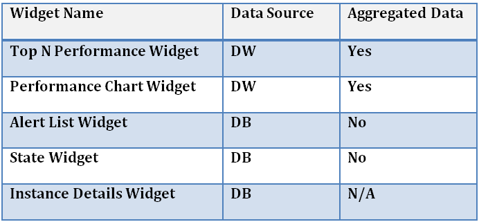
As Dale described in his blog article dashboards are made up of one or more widgets. I wanted to spend some time in this blog article to talk about where and how we are getting some of the data for the widgets we are shipping at RTM.
Hope you enjoyed this post
-Satya