Defending Office 365 with Graph Analytics
In Office 365, we are continually improving the detection and response systems that safeguard your data. We gather many terabytes of telemetry from our service infrastructure each day and apply real-time and batch analytics to rapidly detect unauthorized access.
The same engineers who design and operate the Office 365 service also analyze and act on the output of our intrusion detection system. The context we have about the design of Office 365 allows us to build highly-sensitive detections while differentiating between legitimate service behavior and suspicious activity.
As we have scaled up our telemetry and analysis infrastructure, we have also innovated in how we interact with the results of our detection system. One recent development is the use of graphs for correlation and visualization.
Prior to our graph approach, we represented detection results as a set of tickets in a queue for manual review. We found that it was difficult to group related activity together, and occasional bursts of benign activity would overwhelm the system with irrelevant results.
Representing detection results as graphs has enabled us to
- evaluate intrusion detection results in context with related activity,
- incorporate lower-fidelity indicators without overwhelming us with benign results, and
- determine with greater fidelity when datacenter activity is likely to represent an intrusion.
Representing activity as graphs
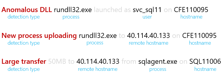
Here are three detection results associated with a recent Red Team engagement: 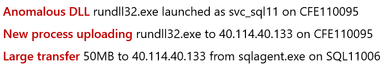
Our first insight was to represent detection results as structured data rather than as free text.
We modified our analysis pipeline to represent each result as a row in SQL with columns for the user, hostname, or network destination associated with the result:
Next, we represented this multi-dimensional data as a bipartite graph of detection types and entities. We discovered that when we represented detection activity in this format, it naturally formed clusters of detection results that had entities in common:
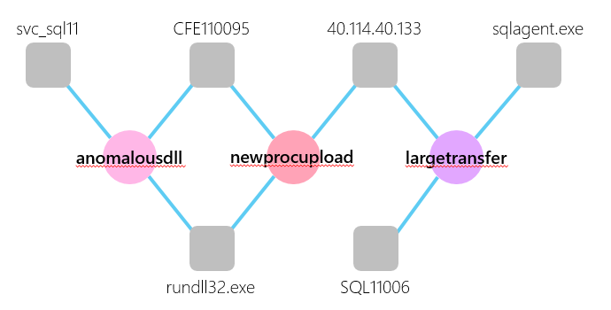
This clustering behavior is similar to the analysis technique that we follow when investigating detection results. Given a detection result on one machine, we look for correlated activity associated with the same server, account, or network destination.
Operationalizing graph clusters
As we continued to refine this graph technique, we hypothesized that an intrusion would be represented in the graph as a cluster of many distinct detection types linked by common entities.
We engaged the Office 365 security team to test our hypothesis with a Red Team engagement. Our telemetry and analytics quickly detected their activity, and our graph approach linked this activity together into one large cluster (at top left in the diagram below):
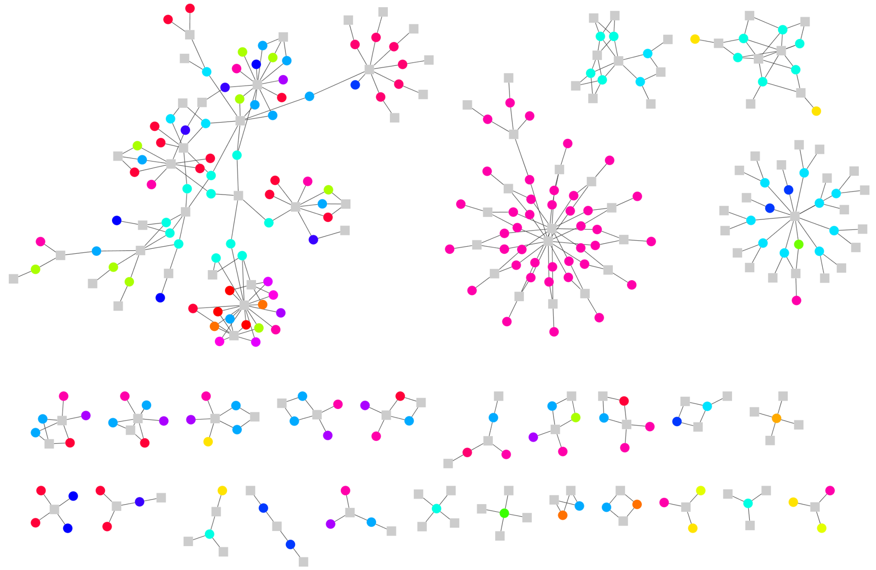
Because related activity forms clusters in the graph, we realized that we would be more effective if we reviewed detection results cluster-by-cluster.
We built a web application using Cytoscape.js to try out this approach. It displays a list of graph clusters and allows us to review each one in detail. Here is an example showing a cluster of extended Red Team activity: 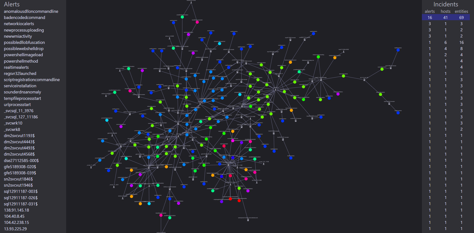
We found that we made faster, more accurate decisions when we used the graph structure to evaluate detection results as clusters of related activity.
Incorporating lower-fidelity indicators
Graphs are also helping us incorporate less-specific intrusion detection analytics into our system without flooding our engineers with benign results.
For example, an analytic may give us results about anomalous logon patterns, but benign anomalies exist in a small quantity every day. Similarly, certain built-in commands may be used by both Office 365 engineers as well as adversaries. In a traditional intrusion detection approach, these analytics would present our engineers with a morass of benign results.
When we adopted a graph approach, we discovered that clustering could help us distinguish between benign results and meaningful anomalies.
We started by classifying our analytics into three categories:
- Alerts: these activities have a significant service impact and are rarely due to benign activity. For example, a new account being granted Domain Administrator privileges would be classified as an alert.
- Behavioral: these activities may occur due to benign service operations but may also indicate unauthorized activity. An example of a Behavioral indicator is a new process executing that has never been observed across the service.
- Contextual: these activities occur very frequently due to benign activity but have forensic value during an investigation. A net.exe process start is one type of Contextual indicator.
Next, we established a grading system for determining which graph clusters to investigate first:
- Any cluster that contains an alert is given high priority and evaluated by an engineer.
- Clusters that contain results from two or more types of behavioral analytic are prioritized as well.
- Contextual results are only presented to engineers if they are part of an alert or behavioral cluster that meets the criteria for evaluation. These results help us understand the “bigger picture” behind the atomic and behavioral activity in a given cluster.
This allows our intrusion detection pipeline to emit thousands of behavioral and contextual results each day while keeping our engineers focused on the clusters of activity that are most likely to represent an attack.
A continuing investment
Our research into graph approaches for intrusion detection is just getting started. If you have questions, suggestions, or comments, I'd love to hear from you! Feel free to reach me on Twitter at @MSwannMSFT.