Introducing OMS Network Performance Monitor
Summary: Perform near real-time monitoring of network performance and localize network faults in Microsoft Operations Management Suite.
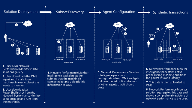
Hi, everyone. Abhave Sharma here, and today I want to talk about a new solution in OMS, Network Performance Monitor (NPM), that helps you perform near real-time monitoring of network performance parameters (such as packet loss and network latency) and localize network faults. It not only detects network performance issues, but it also localizes the source of the problem to a particular network segment or device to make it easy for you to locate and fix a network performance issue.
How does the solution work?
NPM uses synthetic transactions (TCP ping, which is explained later in this post) as a primary mechanism to detect and locate network performance bottlenecks. The solution detects IPv4 and IPv6 subnets that are directly connected to the machines on which the OMS agent has been installed and uploads this information to OMS.
All agents know the other agents that they should ping and note the packet retransmissions and roundtrip time that is encountered for each ping. This data is used to determine the packet loss and network link latency that is then uploaded to OMS, aggregated by the service, and presented to you on solution dashboard.
The following diagram sums up how the solution works
Why TCP ping
You may be wondering why we aren’t using the usual internet control message protocol (ICMP) ping instead of TCP. One reason is that routers do not give the same priority to ICMP traffic as they do to TCP packets. Consequently, ICMP-based pings might provide incorrect results in certain scenarios. Another reason is that HTTP is based on TCP. If we measure TCP performance, we get a good handle on how application response time is affected by the network.
A point to note here is that these pings use almost negligible bandwidth because only TCP control packets are exchanged and no data packets are transmitted for pings.
Monitoring model
Before we talk about the monitoring model, let me explain some of the terminology.
A node here represents the machine (VM or host) on which the NPM solution has been enabled. Connectivity between two network nodes is represented by respective node links.
All nodes that are connected to the same subnet are grouped in a subnetwork. The network connectivity between two subnets is represented by subnetwork links that are composed of one or more node links. The performance metrics that are computed for node links are aggregated to deduce the loss and latency for the subnetwork link.
You can group one or more subnetworks that are related to each other in logical containers called networks and give any name to these networks. The network connectivity between two networks is represented by network links that are composed of one or more subnetwork links.
As an illustration, the following diagram shows two networks: Network A and Network B. Network A is composed of subnetworks 10.10.1.0/24 and 10.10.2.0/24. Network B is composed of a single subnetwork 10.10.4.0/24. Subnets are in turn composed of nodes. For example, subnet 10.10.1.0/24 is composed of Nodes 10.10.1.1 and 10.10.1.2.
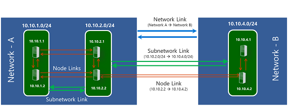
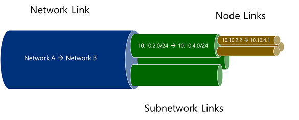
Network links, subnetwork links, and node links have a hierarchical relationship. A network link is composed of one or more subnetwork links. Similarly, a subnetwork link is composed of one or more node links.
The solutions view
Solution Overview tile
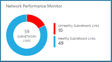
After NPM is deployed and configured, you can see a quick snapshot of the network health on the OMS homepage. The solution tile shows a doughnut chart that depicts the number of healthy and unhealthy subnetwork links.
Click this tile to go to the solution dashboard.
Solution dashboard
The solution dashboard provides a quick glance of what’s happening in your network. The first blade shows a summary of your network: Number of subnetworks discovered (and their network-wise distribution), network links, subnet links, and paths in the system. A path consists of the IP addresses of two agents and all the hops between them.
The Top Network Health Events blade provides a list of most recent health events in the system and the time since the event has been active. A health event is generated whenever the packet loss or latency of a network or subnetwork link crosses a threshold.
The Top Unhealthy Network Links blade shows a list of unhealthy network links. These are the network links that have one or more adverse health event for them at the moment.
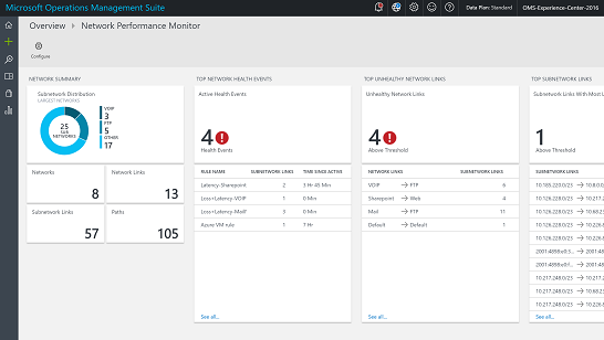
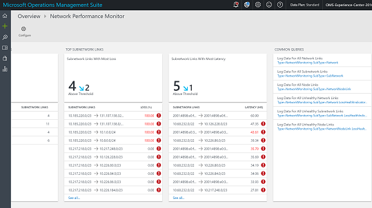
The next two blades show top subnetwork links by packet loss and top subnetwork links by latency.
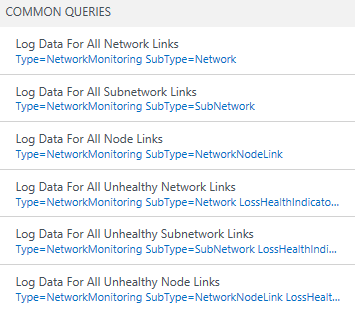
The Common Queries blade contains a set of OMS search queries that you can use to fetch the raw network monitoring data directly. You can use these queries as a starting point to create your own queries for customized reporting.
Drill-down pages
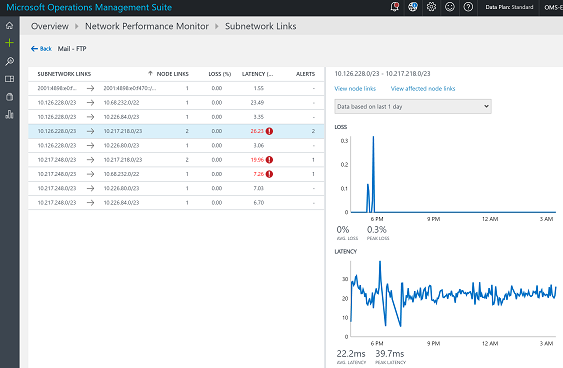
You can click the various links on the solution dashboard to drill down into the area of interest. For example, when you see an alert or an unhealthy network link popup on the dashboard, you can click the unhealthy network link to investigate further. The next page will list all the subnetwork links for the particular network link. You can see the loss, latency, and health status of each subnetwork link and quickly determine the ones that are causing the problem. You can click View node links on the right side to see all the node links that comprise the unhealthy subnet link.
You can now see individual node to node links and find the unhealthy node links.
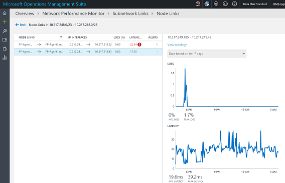
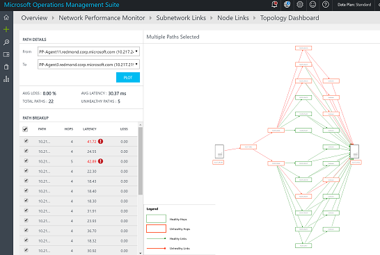
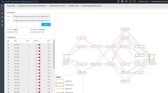
If you click the View topology map link, you will see the hop-by-hop topology of the routes between the source and destination nodes. The unhealthy routes or hops will be colored in red, which will help you to quickly localize the problem to a particular section of the network.
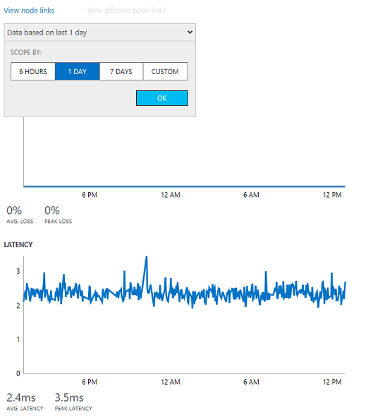
Trend charts
You can easily investigate the usually difficult-to-detect transient issues, which are manifested as sudden spikes, by analyzing the trend of loss and latency for a link. You can change the time windows for which the graph is plotted by using the time control at the top of the chart.
Hop-by-hop topology map
With NPM, you can visualize the hop-by-hop topology of routes between two nodes on an interactive topology map. It gives you a clear picture of how many routes exist between the two nodes and the paths that the data packets are taking. Network performance bottlenecks are marked in red on the topology map. You can locate a faulty network connection or a faulty network device by looking at red elements on the topology map.
OMS search
All the data that is exposed graphically through the NPM dashboard and drill-down pages is also available natively in OMS search. You can directly query this data by using OMS query language and create custom reports by exporting the data to Excel or Power BI. The last blade in the NPM dashboard has some useful queries that can be used as the starting point to create your own queries and reports.
That is all I have for you today. Join me next time when I talk about what’s coming next with the Network Performance Monitor in OMS.
For more information on this new solution, please visit the Operations Management Suite documentation webpage or sign up for a free trial. Follow us on Twitter @MSCloudMgmt.
Abhave Sharma
Microsoft Operations Management Team