How to add a custom button and plugin to tinymce in Umbraco 4.5
Last week I had to create some custom functionality for the tinymce editor in Umbraco. We needed to add a style-based expand/collapse dhtml region for some proof of concept code. I looked for information on customizing the editor in Umbraco 4.5 and could only find bits and pieces. So a coworker and I figured it out for ourselves. It's pretty simple, here's the steps:
This pertains to Umbraco 4.5.
1. First edit this file in the config folder: tinyMceConfig.config. Add a new set of elements to //commands:
     <command>
      <umbracoAlias>mceTest</umbracoAlias>
      <icon>images/editor/mceTest.gif</icon>
      <tinyMceCommand value="mceTest" userInterface="false" frontendCommand="mceTest">mceTest</tinyMceCommand>
      <priority>3</priority>
    </command>
Make sure the values for mceTest all match. You can insert your own image or choose an existing image for icon.
Add to the plugins node:
<plugin loadOnFrontend="false">mceTest</plugin>
Save the file.
2. Create a new folder in \umbraco_client\tinymce3\plugins with the name of your plugin (mceTest in this case).
Inside this folder you need at least 2 files: editor_plugin.js and editor_plugin_src.js. The editor_plugin.js file is the same as the editor_plugin_src.js just compressed. When you are working in debug in your dev environment make sure your changes to editor_plugin_src.js. When you are ready to deploy your plugin, crunch the code and put it in editor_plugin.js.
3. Create editor_plugin_src.js and add the following scaffolding code:
 (function () {

    tinymce.create('tinymce.plugins.mceTest', {

        init: function (ed, url) {


           var t = this;

            t.editor = ed;


            // Register buttons

            ed.addButton(

         'mceTest', {

             title: 'Create collapsible area',

             image: url + '/images/icon.gif',

             cmd: 'testButton'

         });

        },


        createControl: function (n, cm) { return null; },


        getInfo: function () {

            return {

                longname: 'mceTest',

                author: 'mceTest',

                authorurl: 'mceTest',

                infourl: 'mceTest',

                version: tinymce.majorVersion + "." + tinymce.minorVersion

            };

        }

    });


    // Register plugin

    tinymce.PluginManager.add('mceTest', tinymce.plugins.mceTest);

})();
Make sure you replace mceTest with the name of your plugin everywhere in this file. If you are publishing this plugin you can change the longname authorurl and infourl values.
There is plenty of documentation on how to create behavior in this file, and you can look at the other plugin folders to see simple and complicated examples. You can even add html files to create forms when users click your button in the tinymce toolbar.
4. For this example, I am going to be adding a simple Jquery-based expand/collapse widget to the tinymce toolbar, the only code necessary for this example is the following lines added just under t.editor = ed;
         init: function (ed, url) {


            var t = this;

            t.editor = ed;

            ed.addCommand('testButton', function (ui, v) {<br>                ed.execCommand('mceInsertContent', false, '<p></p><div class="ExpColCon"><div class="ExpColTitle">Title Goes here</div><div class="ExpColBod"><p>Body<br/>Goes</br/>Here</p></div><p></p>');<br>            });


            // Register buttons

            ed.addButton(

         'mceTest', {

             title: 'Create collapsible area',

             image: url + '/images/icon.gif',

             cmd: 'testButton'

         });

        },
What will this code do? It will insert into the editor some html markup with styles for expand/collapse (I'll show you the Jquery to make this work on the actual templated web page below). It will be easy for the end-user to update these fields with their own text/html.
5. To make sure the end-user can understand what they are seeing, edit the css for the editor form which is located in \umbraco_client\tinymce3\themes\umbraco\skins\umbraco\content.css
.ExpColCon

{

  padding:7px;border:1px dotted #333333

}


.ExpColTitle

{

     padding:3px 3px 3px 20px;border:1px dotted blue; color:blue;

        font-family:Verdana,Arial,Helvetica,sans-serif;

     font-size:80%;

      font-weight:bold;

       background-image:url('/umbraco/images/Lplus.png');

      background-position:0px 3px;

        background-repeat:no-repeat;

}


.ExpColBod

{

        padding:3px 3px 3px 20px;border:1px dotted red; color:#666666;

}
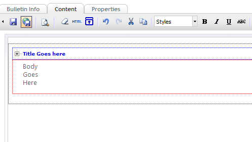
Now when you click the button to add the expand/collapse region, you will see it outlined in the editor. NOTE that this CSS is NOT The CSS on the resulting public facing template. You can define other styles there. This CSS is just helpful for the end user writing content in the tinymce editor.
So if you've done all this, then go to your Umbraco CMS authoring environment. You may need to dump your cache as Javascript and CSS files get cached and your state may not be correct.
6. Create a new Datatype using the tiny MC3v3 wysiwyg Render Control. You should see your new button as one of the choices. Make sure you check that button and save your new DataType.

7. Save your DataType. Create a new DocumentType and add a new property based on your new DataType.
In your content when you create a new Document based on your DocumentType, you should see the tinymce editor show up with your new button!
When you click the button, some markup will be added to your editor surface. Because we added the css to the editor's content.css file, the expand/collapse fields are easily marked:
Now it's easy for an end user to update the title and the body of the expand collapse field. To use this code in your template just add this simple Jquery:
     <script src="https://ajax.aspnetcdn.com/ajax/jquery/jquery-1.4.4.js" type="text/javascript"></script>

    <script type="text/javascript">

        var expcolconstyle = ".ExpColCon";

        var expcoltitlebodycontainer = "div";

        var expcolconselector = expcolconstyle + " " + expcoltitlebodycontainer + ":nth-child(#)";

        var expcoltitleselector = expcolconselector.replace("#", "1");

        var expcolbodyselector = expcolconselector.replace("#", "2");

        $(document).ready(function () {

            $(expcolbodyselector).hide();

            $(expcoltitleselector).attr("style", "cursor:pointer");

            $(expcoltitleselector).click(this, function () {

                var expcolbody = $(this).parent().children(expcolbodyselector);

                expcolbody.toggle();

                //alert(expcolbody.text());

            });

        });

    </script>
You'll notice only the wrapping DIV.ExpColCon is important. The first child (regardless of style) will be treated as the Title and the the second child will be treated as the body. This gives you freedom to change these styles in the future.
Thanks,
Mike