Perfmon data viewing nuance…
Recently, I have been running in to a perfmon nuance that I would like to call out. On any given performance troubleshooting day which is almost every day, I open up Perfmon, select the BLG file of choice and then add the appropriate counters that I would like to view.
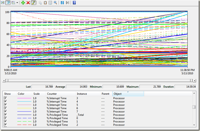
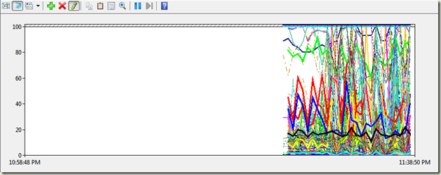
In this instance, I was presented with the following view.
The odd thing is that all instances are linear in fashion for both increasing or decreasing counter values. Something surely is not right. As you can see, this is not helpful at all.
Since I know that this perfmon has data in it, I needed to find a way to view this information as it was crucial we found root cause of the issue with the data provided.
One of the reasons that this could happen if there are long gaps of uncollected data in the perfmon file as data it being appended to the existing BLG file. So if I started a perfmon up for 1 second and then immediately stopped it, I would collect one sampling of data. If my perfmon data collection is setup to append data to the existing blg file, then the next time the perfmon collected is started it will append the data to the existing BLG file. Since we average out the data over the last 100 samples, you can clearly see that the averages here will be way off and will show data similar to the above screen capture.
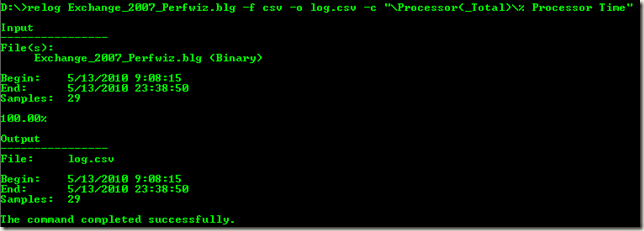
So how do I overcome this? Well, first, you need to find out where the data gaps are in the perfmon file. To do this, you can use the relog utility that comes with Windows to dump out the blg file to csv format. To make this easier, I use the \Processor(_Total)\% Processor Time counter to export this data on as that counter is normally collected in every perfmon file. The syntax of the command is below along with the associated result information.
In the above case, we can see that the blg contained information for 14 hours, but only 29 samples were taken. Based on that alone, the numbers do not add up.
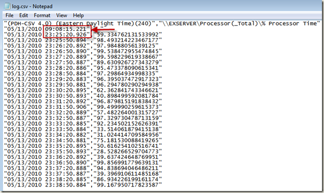
If you open the log.csv file in notepad, you should get an output similar to the following. As highlighted below, you will see the actual gap in data collection which was throwing off the view in perfmon. This output will also give us the time interval that this perfmon was taken which was every 30 seconds. This time interval is extremely important to me when viewing perfmon data for any Exchange Performance related issues.
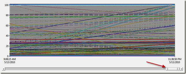
The first data sampling is what we don’t need here, so we need to change our Time Range in Perfmon by moving the slider bar over to the right approximately one hour before the data capture
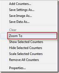
Once you have the slider where you want it, right-click the slider bar and then select Zoom to as shown below as shown in the following pictorial.
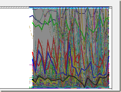
What you should now see is some resemblance of performance data.
What you now want to do to remove the whitespace surrounding the capture is to left-click and drag to the right the time slider until you have highlighted the data you want to look at. Once selected, right-click the window and select Zoom To to zoom in to that time frame.
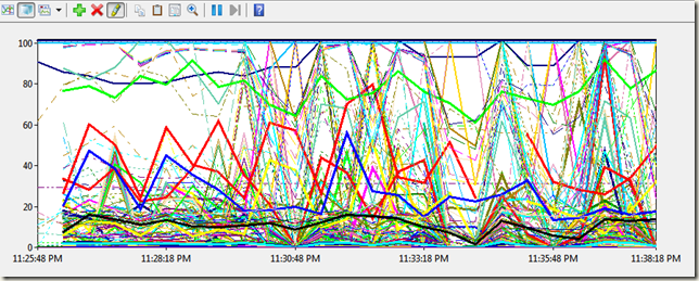
What you should now see if the actual data you want to look at.
Another way of being able to view this data is to use the relog utility to export out specific timeframes in the log. Since we know the start and end times of the data we want to view, we can simply run the following command to export data between specific times to an export.csv file. Once you pull up the data in perfmon for this export csv file, you will have the same view as the one listed above.
I hope this helps you decipher whether or not a perfmon file has been corrupted or the data just does not look correct for whatever reason.
Happy performance viewing!!
