DFSR Debug Analysis with Message Analyzer – Part 8, DFSR Debug Log Charts
This post continues the series that started here.
Up to this point I’ve discussed building a parser for Message Analyzer that will interpret DFSR debug logs. The last thing I want to cover is the construction of some charts. These charts will provide a view of message throughput over time – something I’ve found useful in the past.
Chart – DFSR Messages Over Time
The first thing I’ll need to do is create a new chart. I do this by selecting the Session menu and then selecting New Viewer –> New Chart.
After doing so, I get a new chart view and the chart editing dialog to its right.
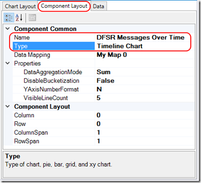
I’ll start by replacing the chart Name with something descriptive on the Chart Layout tab and then move to the Component Layout tab. On the Component Layout tab I’ll provide a chart title and change my Type to a Timeline Chart .The rest of the options I’ll leave as defaults –
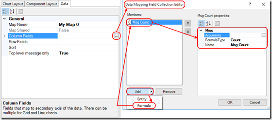
Moving to the Data tab I’ll begin by clicking the ellipsis next to Column Fields and then adding a formula that will count messages –
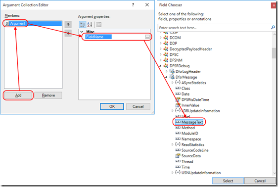
I then click the ellipsis next to Arguments, add an argument and populate its FieldName with the MessageText field from my DFSRMessage in my DFSRDebug log parser –
So far my chart is going to count MessageText instances (which occur in every message).
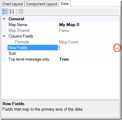
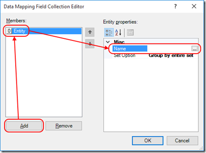
Back in the Data tab of the chart editing dialog, I’ll click the ellipsis next to Row Fields –
The first entity I choose plots a separate line for each distinct value in that field.
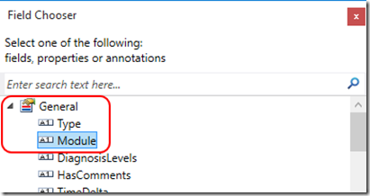
I’m interested in total DFSR message volume over time so I’ll choose a field that is the same in every message. All of my messages are parsed by the DFSRDebug log parser so I’m going to choose General –> Module (Module stores the name of the parser) –
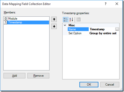
Lastly, I add another entity which is Global Annotations –> TimeStamp (this field is necessary for a Timeline Chart) –
The chart now plots DFSR Messages over Time –
I can save the chart from Session –> Charts –> Save Chart.
Chart – DFSR Messages by Class over Time
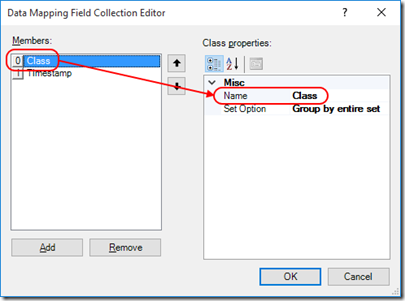
By changing the primary entry in the Row Fields described above, I can slice my data into separate categories. I’ll select Class from my DFSRDebug log parser DFSRMessage –
This plots DFSR Messages by Class over Time –
Chart – DFSR Messages by Method over Time
Similarly, I am able to plot DFSR Messages by Method over Time –
Filtering
Charts may be filtered in the same way as the Analysis Grid. By filtering for specific text in the MessageText field, I can reproduce the view produced in my earlier post -
Filter is DFSRDebug.MessageText contains "USN_RECORD:"
With the complete set of messages in my original post, DFSR Messages over Time appears as –
Next Up

