Windows Enterprise Client Boot and Logon Optimization – Part 5, Windows Performance Analyzer - A Tour
This post continues the series that started here.
Up to this point, I’ve discussed a process you can use to benchmark your Windows client image as it’s designed. In this way you can come to understand how choices you make influence boot and logon performance of your image on specific system hardware.
Going forward, I’ll be talking about how you can troubleshoot and isolate boot and logon performance issues that unexpectedly creep into production. This is the hard (or harder) stuff.
Before we get to troubleshooting, I want to give you a tour of the tool you’ll be using. In addition to using xperf.exe for producing a boot Summary.xml (discussed in Part 3), you need to be familiar with Windows Performance Analyzer (WPA) .
Windows Performance Analyzer (WPA)
WPA.exe is in your path after you install the Windows Performance Toolkit (WPT) . For analysis, I recommend completing a full installation of WPT instead of a flat-copy (discussed in Part 2). You can safely copy .ETL trace files to an analysis system to save you installing the tools on every client that has an issue.
The additional benefit to a full install is that .ETL files will have a file association to WPA. Double-clicking an ETL file will open it and the default view you’ll see is this -

At this stage, it’s not beneficial to explain every option. I want to cover just enough to get you started. As this blog series continues, I’ll introduce new features when they’re needed.
System Configuration
The first thing I find useful in troubleshooting boot and logon performance is to see system details. This information is available by selecting System Configuration from the Trace menu. Doing so opens a new tab in the analysis view. Here you can see I’ve selected the Storage category where I can retrieve details of the physical disk.

In this example, you’ll notice the system uses a virtual hard drive – it’s a virtual machine running on Hyper-V.
For a physical system, you’ll see the manufacturer and model number that may be used to research disk detail. You may find the hard drive to be a 5400 RPM rotational drive and further analysis showing saturated disk utilization. This may be evidence enough for a disk upgrade.
If you’re finished with System Configuration, you can close the tab just as you would with an Internet browser.
Graph Explorer
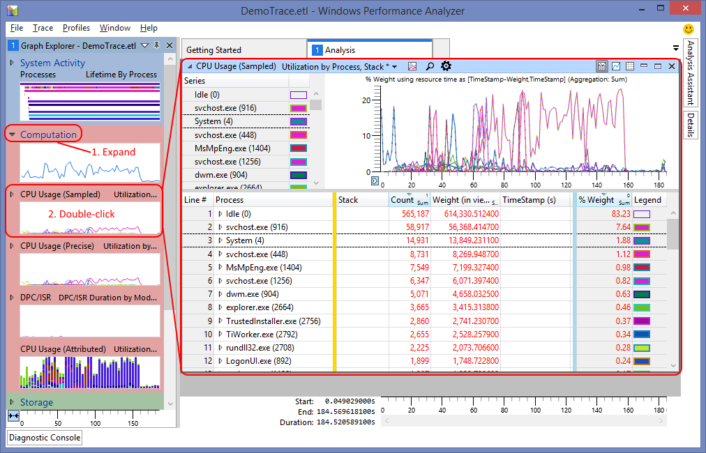
The left-hand pane, called Graph Explorer, provides access to a number of pre-defined analysis graphs. These graphs are categorised in System Activity, Computation, Storage, Memory, Power and others depending on the options selected during trace capture.
Expanding a category provides access to the graphs. Double-clicking a graph adds it to the current analysis view -

Here, I’ve added the CPU Usage (Sampled) graph and its data table.
As more graphs are added to the analysis view, they’re stacked on top of each other and the analysis view gains a vertical scroll bar.
Graphs
Graphs may be highly customised and their display is tied to the ordering of columns in their attached data table. You’ll see a lot of examples of this as the blog series continues but for now, understand this -
- Columns to the left of the golden bar trigger aggregation
- Without anything to the left of the golden bar, the table would display every single event as a separate row. In the screenshot above, Process is the aggregator and columns in the middle of the table are added or counted (depending on configuration). Again referring to the screenshot above, we see there were 58,917 events captured for svchost.exe (916)
- Columns to the right of the blue bar are called the graphing columns and their type determines the graph format
- Numeric columns –> line graphs
- Timestamps –> checkpoint graphs
- A pair of timestamps –> Gantt chart
- An offset column –> state transition graph
To gain a feel for this, I suggest you try opening a few graphs for yourself. Examples of each graph type mentioned above are -
- Computation –> CPU Usage (Sampled)
- System Activity –> Generic Events
- System Activity –> Processes
- Storage –> Disk Offset
During the analysis I’ll show you, there are times where I’ll modify the table. You should be aware that this alters the appearance of the graph.
In situations where I want to maintain the graph but modify the table, I’ll open two instances of the same graph, hide the table of the first instance and hide the graph of the second instance. This is achieved using the buttons in the top right corner of each individual graph -

You’ll often want to focus on a small region of the graph. You may zoom to that region by highlighting it and right-clicking -

Zooming in this way, not only expands the interesting region across the analysis view but also filters the data table to display only events occurring in that region.
Analysis Views
Opening WPA provides you with the first analysis view. All graphs in the same analysis view are subject to zooming. In other words, selecting a region in the CPU Utilization (Sampled) graph and zooming to it, performs the same operation on every other graph residing in the same analysis view.
New analysis views allow separate streams of investigation. To create a new analysis view, open a new tab -

Conclusion
For now, I’ve covered WPA in enough detail to make a start on boot and logon performance analysis. As this series continues, I’ll introduce new WPA features in the context of the task I’m talking about.
Next Up