Service Manager Dashboards in Power View - Part 2
Let's create an interactive Service Manager dashboard in Power View!
I'm a big fan of Power View – if you're not familiar with Power View, it's the amazingly cool feature of SQL Server, which gives us presentation-ready dashboards in SharePoint and Excel.
Up until recently, Power View needed data to be formatted in the Business Intelligence Semantic Model (BISM), like a tabular OLAP cube. We did kind of have the ability to get Service Manager data into Power View, but had to use Power Pivot as a middle man, to get it into BISM format.
Great news!! Power View now natively supports Multidimensional OLAP cubes, which is exactly what we have available in the Service Manager Data Warehouse. This means, we can now use Power View in SharePoint to create AMAZING dashboards for Service Manager.
This new support came in Cumulative Update 4 for SQL Server 2012 SP1. Therefore, you're SQL bits will need to be up to date – at the time of writing that was SQL 2012 SP1 CU5. For further information, see https://blogs.msdn.com/b/sqlrsteamblog/archive/2013/05/31/power-view-for-multidimensional-models-released.aspx.
This blog walks through configuring reports in Power View. If you want further information on how to setup Power View, see my previous blog which looks at how to setup a test lab VM, hosting all the required components.
CREDIT: We're going to setup something similar to the Excel dashboard, which my colleague Antoni Hanus created on his excellent blog at https://blogs.technet.com/b/antoni/archive/2013/05/18/how-to-create-an-incident-dashboard-using-excel-in-system-center-2012-sp1-service-manager-scsm-2012.aspx. Thank you Antoni for doing all the hard work J
Step 1 – Create a new Power View Report
As in my previous post, you should have already created the Report Data Source, to the Work Items OLAP cube.
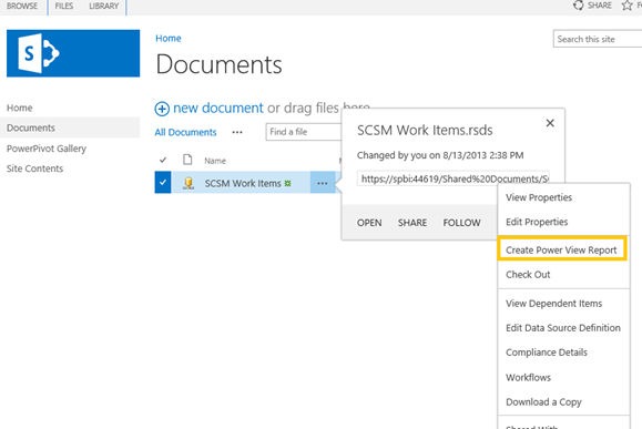
- On your SharePoint site, go to Documents
- Your Report Data Source should be listed
- Click the ellipsis "…" next to the data source
- Click the ellipsis next to 'FOLLOW' in the pop-up
- Click "Create Power View Report"
Step 2 – Start editing Power View
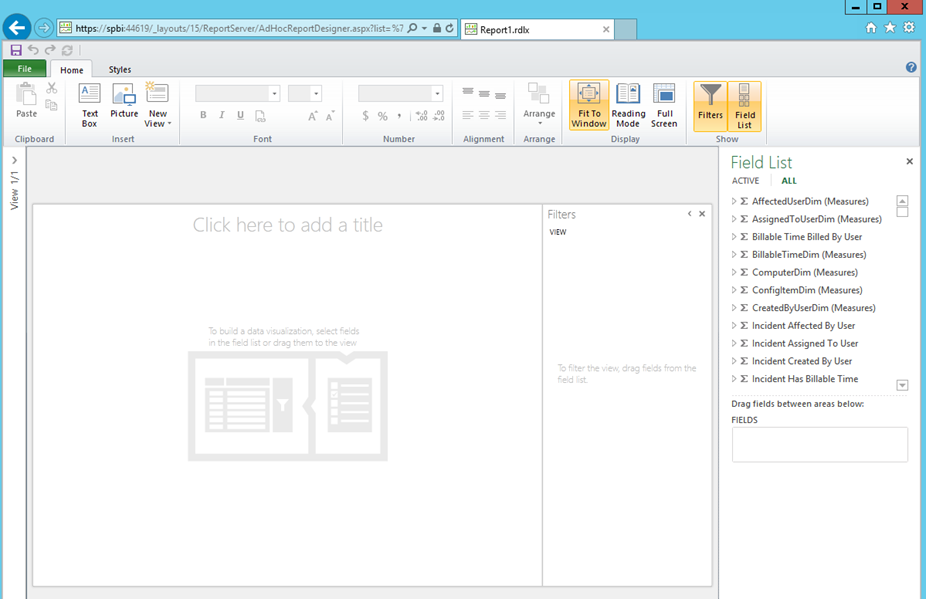
- This now should have opened up Power View in the Edit view. This is where we can build our dashboard
- The options we have on the right hand side under 'field list' are the same as you may have already used from Service Manager via Excel in a Pivot Table. For more information on using Excel, please see Antoni Hanus' blog at https://blogs.technet.com/b/antoni/archive/2013/05/18/how-to-create-an-incident-dashboard-using-excel-in-system-center-2012-sp1-service-manager-scsm-2012.aspx.
Step 3 – Measures & Dimensions
The items under 'Field List' are sorted into Measures & Dimensions. We need to get a grip on this first.
As a start, read the great explanation at https://msdn.microsoft.com/en-us/library/aa561647.aspx.
A really simple way to think about them:
- Measures are numerical values, such as 'Incidents Active' or 'Incidents Breaching SLO Percentage'
- Dimensions are properties, such as 'Incident ID' or 'Incident Created Date'
We can tell which items are Measures as they are listed with the Sigma symbol:
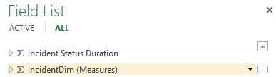
Whereas Dimensions have a grid icon:
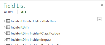
You can see here we can have the same item listed twice. For example, IncidentDim is listed twice. This is because one of the listings contains Measures, whereas the other domains Dimensions.
Step 4 – Incidents By Classification
OK – let's build something! Under the 'Field List' on the right:
Expand IncidentDim (Measures)
Tick Incidents Active
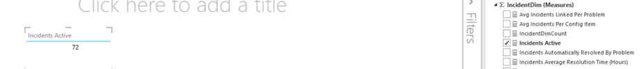
- This will start building the table automatically!
- Next, scroll down in the Field List & find IncidentDim_IncidentClassification
- Expand that & click IncidentClassificationValue
- You now should see it's split up the Incidents we have by classification:
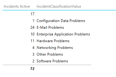
- Note – those Incidents listed without a classification, are Incidents which have simply not had a classification set yet.
- I want to change this into a bar chart.
- Click on the Table. From the ribbon, click on the Design tab
- Simply click Bar
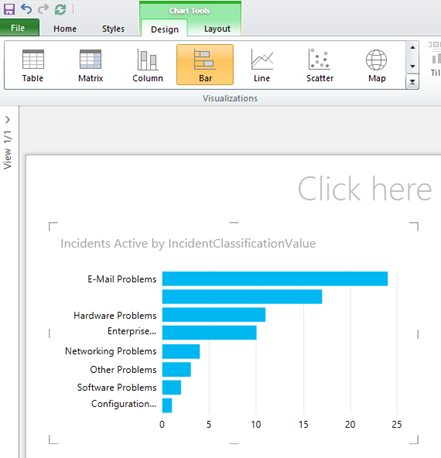
- We have a few options to customize this chart.
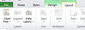
- Click on the Layout tab in the ribbon
- You can chose to show or hide the Chart Title. I've hidden mine
- The Data labels can show the exact number of incidents on the chart if you like
- Have a play with the chart. Note you can resize it & move it around easily.
Step 5 – Incidents By Status
We now want to create a different chart. Click off your bar chart, just onto the blank canvas of the Power View Report
- From the Field List, expand Incident Dim (Measures)
- Click IncidentDimCount
- Note – this creates a new table, displaying the total number of incidents
- From the Design tab in the ribbon, select Pie
- From the Layout tab, you can select the title & where to position the Legend
Step 6 – Incident SLA Status
Next up, let's add in a chart to show the Service Level Objective data from Service Manager
- Click on the blank canvas in Power View
- From the Field List, expand the measure Incident SLA Instance Information
- Tick IncidentSLAInstanceInformationCount
- Scroll down and find the Dimension SLAInstanceStatus
- Tick SLAInstanceStatusValue
- From the Design tab in the ribbon, I also set this chart to Pie
Step 7 – Incidents By Source
OK, this is starting to look good!!!
- Click on the blank canvas in Power View
- From the Field List, expand Incident Dim (Measures)
- Click IncidentDimCount
- Note – this creates a new table, displaying the total number of incidents
- Scroll down and expand the Dimension IncidentDim_IncidentSource
- Tick IncidentSourceValue
- From the Design tab in the ribbon, I also set this chart to Pie
Step 8 – Incidents By Created Date
- From the Field List, expand Incident Dim (Measures)
- Click IncidentDimCount
- Note – this creates a new table, displaying the total number of incidents
- Scroll down and expand the Dimension IncidentDim
- Tick Created date
- From the Design tab in the ribbon, I've set this to Line
Step 9 – Housekeeping
Rearrange:
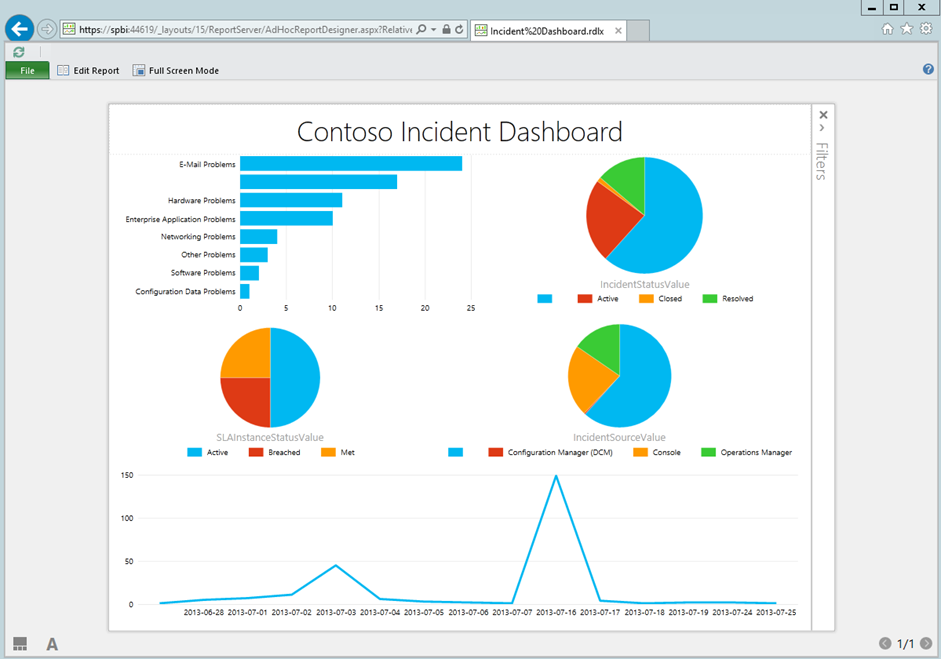
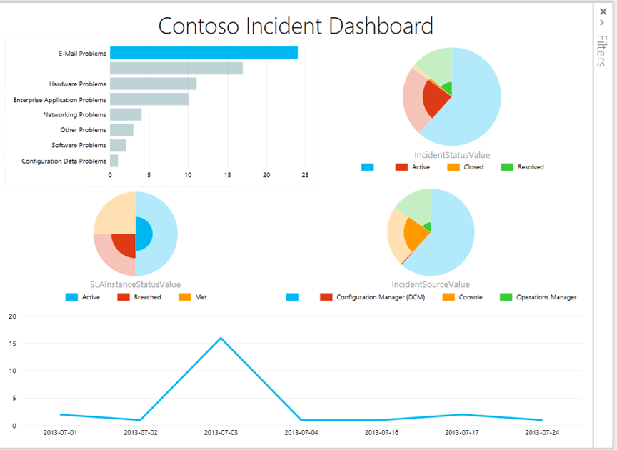
- Move & resize all your charts to fit in the page nicely. You can see my screenshot at the top of this blog post
Set the title:
- Click where it says 'Click here to add a title'
- Go ahead & set the dashboard title as you wish
From the Styles tab in the ribbon
- Note you can alter the colour scheme to one of the many canned schemes
- You can also change the background, even to a fancy gradient
Create New views
- You can think of Views as slides in PowerPoint
- From the Home tab in the ribbon, you can click New View
- This will create a new view, which we can navigate from the left side of the screen
- These can be used exactly like slides, with other dashboards. Great for presentations.
Step 10 – Save to Gallery
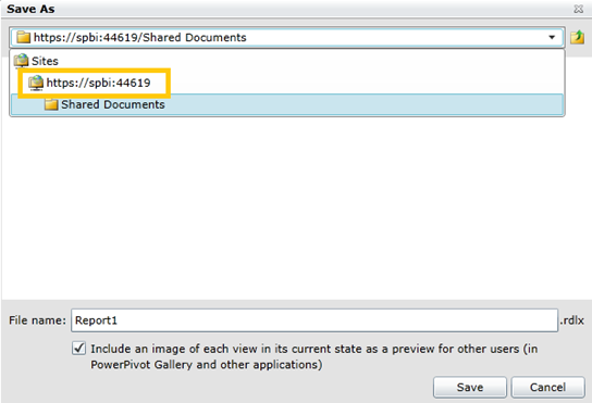
- Click the Save icon in the top left corner
- In the Save As window, click the drop down list
- Select your site, e.g. mine is https://spbi:44619
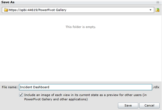
- Double click the folder PowerPivot Gallery
- Save in the PowerPivot Gallery folder. Give the File a Name
- Leave the tick-box ticked & click Save
Step 11 – PowerPivot Gallery
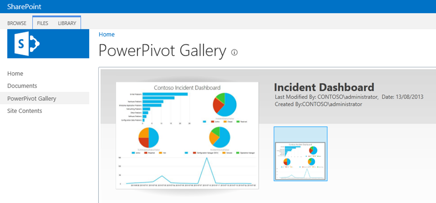
- Go back to your SharePoint site
- Click on the PowerPivot Gallery
- You should now be able to see your dashboard listed in the gallery. This is a great view which you can publish to your organisation
- Each of the thumbnails on the right are views – this is why you may want to have several views in a single Power View report
- In the Library ribbon at the top, click the drop-down list which says Gallery and change to Carousel to see another cool view!
Step 12 – Enjoy your report!
- Click on the report from your PowerPivot Gallery to open it up.
- Note – it opens up in reading mode. This hides all of the report building parts. This is what consumers of your report will see.
- Note – You can see the refresh button in the top left corner. This will reload the new data from the OLAP cube
- You can also click Full Screen Mode. That's great for presentations!
Now for the fun bit. These charts in Power View are INTERACTIVE! To see this:
- In the Incident Classification Bar Chart, click on one of the bars. I've clicked on the bar for 'E-mail Problems'
- Notice – the whole rest of the report automatically filters!! This will filter all of the other charts to show only Email incidents!
- Simply click off the bar to turn the filter off!
- This is fantastic for looking for trends, or slicing data up by department, date, source, etc! There's really no limit!
In Summary
This example is really the tip of the iceberg! This is a simple demo of how to use Power View to create a presentation-ready dashboard directly from the Service Manager Data Warehouse.
There are a whole bunch of features in Power View which we've not looked at in this example. I intend on blogging further on this, in particular, to cover:
- Scatter Charts
- Filters
- Maps Charts using Bing Maps integration!