Data Exploration with Azure ML
This guest post is by the faculty of our upcoming Data Science MOOC, Dr. Stephen Elston, Managing Director at Quantia Analytics & Professor Cynthia Rudin from M.I.T.
Data exploration and visualization is a fascinating subject and aspiring data scientists can build their skills in this area with the upcoming edX course. During this course we will delve deeply into the required tools and essential data science skills.
A thorough understanding of the dataset is essential in any data science project. Careful examination of data reveals the relationships between the features and between the features and the label. These relationships combined with some problem domain knowledge are the basis of good feature engineering.
Further, understanding the structure and relationships in your dataset is necessary when selecting and improving the performance of ML models.
Graphical data exploration, or Exploratory Data Analysis (EDA), was introduced by John Tukey in the 1960s. Tukey created multiple powerful graphical methods to develop understanding of complex data sets, many still commonly used today. His classic book is still in print: Exploratory Data Analysis, John W. Tukey, Pearson, 1977.
As data scientists, we ask many questions when graphically exploring a data set including:
Which features appear to track the behavior of the labels in some way? We are always on the lookout for features which will improve model performance. Conversely, features which show only random behavior with respect to the labels, will likely only add noise if used for training an ML model. Be careful, correlation should never be confused with causation! Causation can only be determined with domain knowledge.
Which features show independent behavior? Conversely, we must eliminate features which are nearly collinear to other features or otherwise redundant. These features will only add noise when used to train an ML model.
Do the features contain outliers? Can we validate that these data are indeed outliers and not interesting, unusual cases? If there are outliers, what treatment should we apply?
Are there degenerate features which only add noise if used for training an ML model? For example, a feature may have mostly a single value, say zero, and few other values. In many cases, such a feature conveys no information. But, be careful, perhaps those few different values represent important special cases of interest.
Are there trends or biases in the data which we must account for before we can build an ML model? This is particularly important in time series or forecasting models.
Let’s have a look at some data and see what we can learn. The figure below shows a conditioned scatter plot of four dimensions of the energy efficiency dataset. You can find this dataset as a sample data set in the Azure ML Studio, or download from the UCI Machine Learning Repository. These data are discussed in the paper by A. Tsanas, A. Xifara: 'Accurate quantitative estimation of energy performance of residential buildings using statistical machine learning tools', Energy and Buildings, Vol. 49, pp. 560-567, 2012.
These data contain eight physical characteristics of 768 simulated buildings. These characteristics, or features, are used to predict the buildings’ heating load and cooling load, measures of energy efficiency. The ability to predict a building’s energy efficiency is valuable in a number of circumstances. For example, architects may need to compare the energy efficiency of several building designs before selecting a final approach. Using a series of carefully constructed charts, we explore these data to determine which of these features are suitable for use in an ML model.
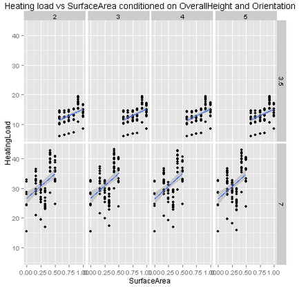
At first glance, this plot looks rather complicated. It contains a lot of information since we are projecting four dimensions of the data into two dimensions represented on a screen. We are using a graphics technique known variously as conditioning or faceting. This method was introduced over 20 years ago by Prof Bill Cleveland, then at Bell Laboratories, who used the term ‘trellis graphics’. Cleveland’s book is still a worthwhile read: ‘Visualizing Data’, Cleveland, William S., Hobart Press, 1993.
How do we read this plot? First, notice the plot is divided into multiple panels, each containing a scatter plot. The scatter plot shows the heating load, or label on the vertical axis and the surface area, a feature, on the horizontal axis. Four tiles across the top of the plot show the levels or values (2, 3, 4, 5) of one feature, the building orientation. On the right side of the plot are two tiles showing the values (3.5, 7.0) of another feature, the building overall height factor. Each of the scatter plots contains a data subset for values of both building orientation and overall height factor. For example, the scatter plot in the upper left shows the subset of the data with building orientation of 2 and overall height factor or 3.5. Finally, we have added a trend line to each scatter plot, computed using a simple linear regression.
What can we learn from this plot? Notice the data in the upper row of plots range between 5 and 20, whereas the data in the lower row of plots have most values between 20 and 45. Thus, we ascertain a significant difference between buildings with different overall height factors. But, the distribution of the data across the columns in each row does not appear to change much. This fact indicates that building orientation is not significant in predicting building energy efficiency. Finally, notice that there is a clear trend in heating load with surface area. However, the linear trend line does not seem to fit the data very well, an indication of some type of nonlinear behavior.
The plot shown used the R ggplot2 package running in a Microsoft Azure ML Execute R Script module. The conditioning or faceting used in the plot is specified with the facet_grid function. The code to generate this plot in Azure ML is shown in the listing below.
eeframe <- maml.mapInputPort(1)
Library(ggplot2)
title <- "Heating load vs Surface Area conditioned on OverallHeight and Orientation"
ggplot(eeframe, aes(SurfaceArea, HeatingLoad)) +
geom_point() +
facet_grid(OverallHeight ~ Orientation) +
ggtitle(title) +
stat_smooth(method = "lm")
In Azure ML we can make a similar plot using Python plotting tools, including the rplot package, with the following code running in an Azure ML Execute Python Script module:
def azureml_main(frame1):
import matplotlib
matplotlib.use('agg') # Set backend for Azure ML
import pandas.tools.rplot as rplot
fig = plt.figure(figsize=(12, 12))
ax = fig.gca()
plot = rplot.RPlot(eeframe, x = 'SurfaceArea', y = 'Heating Load')
plot.add(rplot.TrellisGrid(['Overall Height', 'Orientation']))
plot.add(rplot.GeomScatter())
plot.add(rplot.GeomPolyFit(degree=2))
plot.render(plt.gcf())
fig.savefig('scatter.png')
Data exploration and visualization are essential data science skills. Understanding the structure and relationships in any dataset is an essential part of the data science process. Enjoy your exploration of this fascinating subject.
Stephen & Cynthia