Bad design is everywhere
I was trying to paypal some money to my sister a minute ago, and I sat at the payment page wondering what I’d done wrong. A one minute task suddenly took five minutes as I scratched my head and clicked around to see what I’d missed.
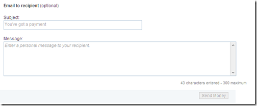
Here’s what I saw – can you figure out why I thought something was wrong?
The text on the “Send Money” button is gray! I instantly assumed it was grayed out because some required field or another was missing, or I’d skipped a step… but finally I decided to just try clicking on it and, yep, it worked fine.
