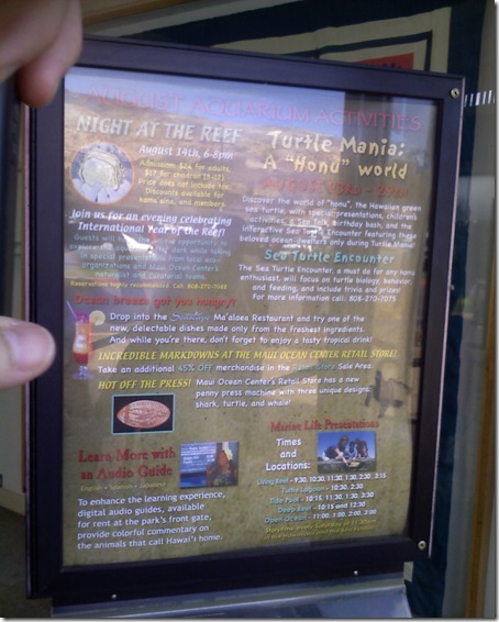
Worst sign, ever.
I saw this sign while on vacation. I think this sign should be in a graphic design puzzle book, one of those "Can you find everything that's wrong with this picture?".
Two weeks later, my eyes are still hurting from the maniacal number of fonts, colors, sizes, single column vs two column, left justification vs centered, caps vs non-caps...aghhhh!
On the bright side, it's nice to have a reminder from time to time about how valuable professionally-done graphic and print design is.
And I admit - I was so disgusted with the sign that I actually forced myself to read the whole thing and marvel at its ugliness. Perhaps that was their devious goal from day number one... naaah.
I was reminded of this sign today because we're having an internal debate about a certain piece of UI that currently has no icons on it, and some people believe that adding icons will make it more aesthetically pleasing. It's so difficult to talk about such subjective things as aesthetics - and while in general icons and imagery can be useful and add value to the user, everything on a page has a potential of contributing to visual overload, and so we need to carefully balance several different (and all highly subjective) criteria to make these kinds of decisions.
