Time normalization: a SQL CLR approach to address unevenly-spaced data samples
One very common challenge in the IT department is to represent time driven data. Think about performance counter values, weather data or, more simply, your own weight tracking. This kind of data is taken in samples: each sample is defined by the collection time. When we try to visualize the data, we often need to make sure the time scale is linear and homogeneous. In other terms we want each sample to be equidistant from the previous and the following one. This is what we expect (although there are different scales we will talk about linear here) most of the time. While the representation is expected to be linear in time, the samples may be not: this causes problems when we want to represent the data visually.
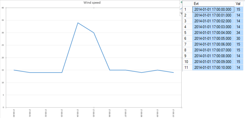
Let’s talk about a simple example: the wind speed measurement. Suppose we have a telemetry telling us the actual speed of the wind. The data will be roughly like this:
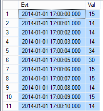
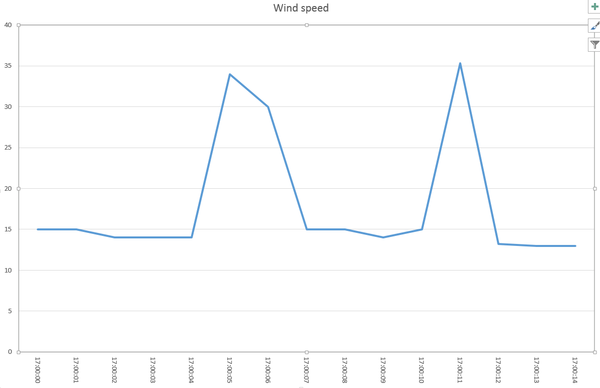
Notice that we have 11 equidistantiated samples (one each second). This will translate very well in a graph:
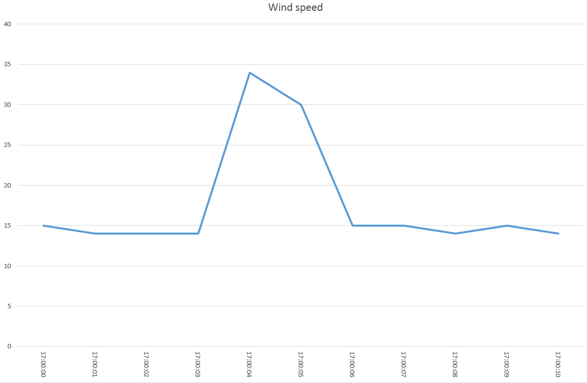
Looking at the graph, you can clearly see that there was a spike lasting two seconds. Otherwise the value is more or less constant.
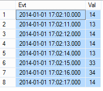
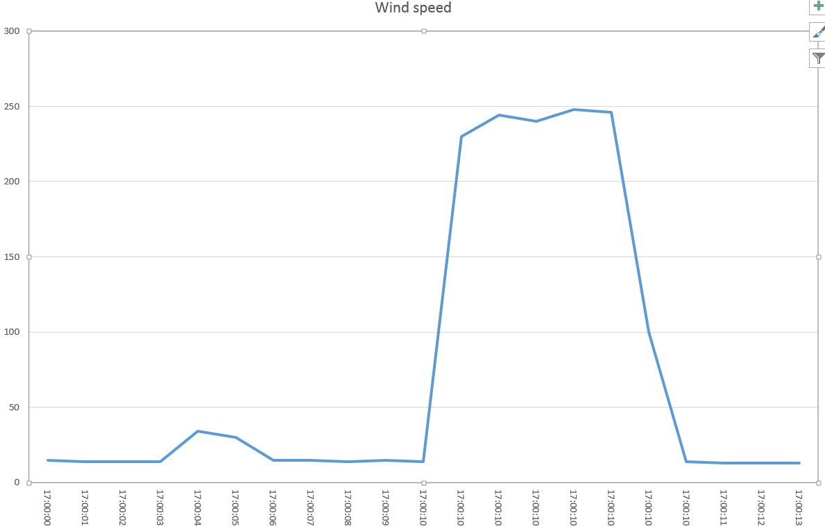
Now we suppose we lose the connection for 2 minutes with the telemetry and we lose data. When the connection is restored we receive another 8 samples:
The graph becomes this one:
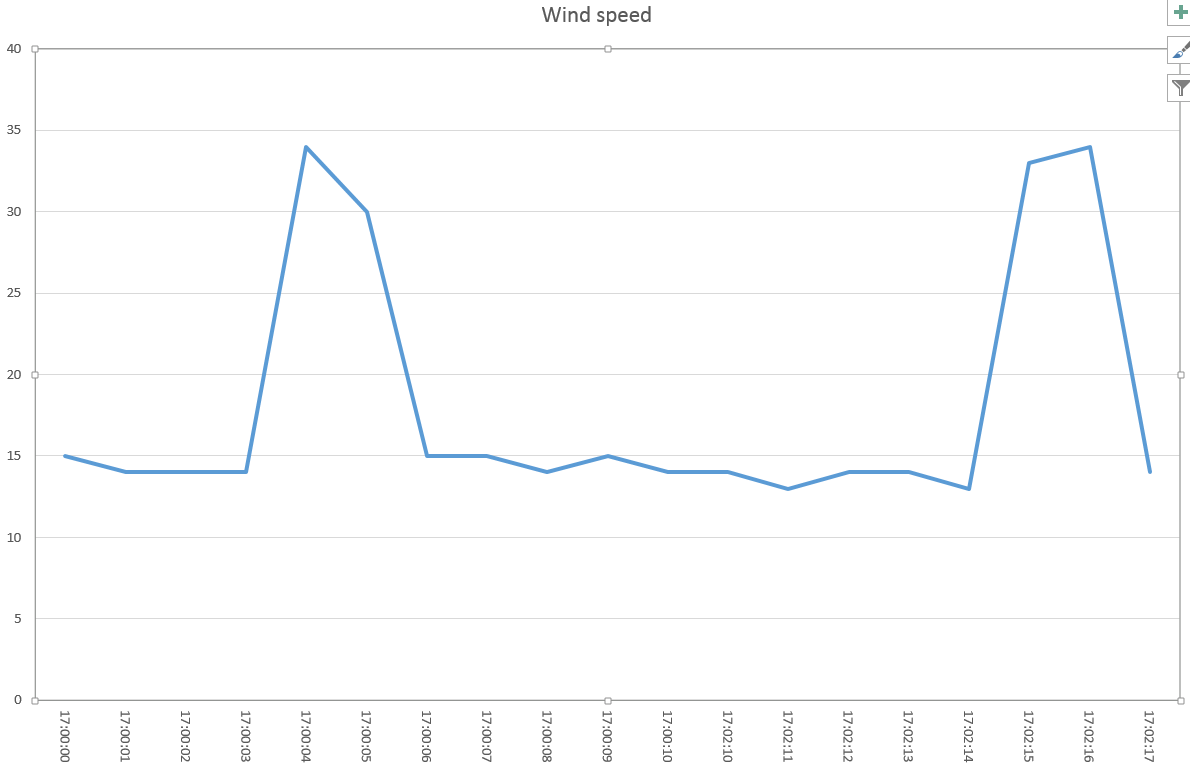
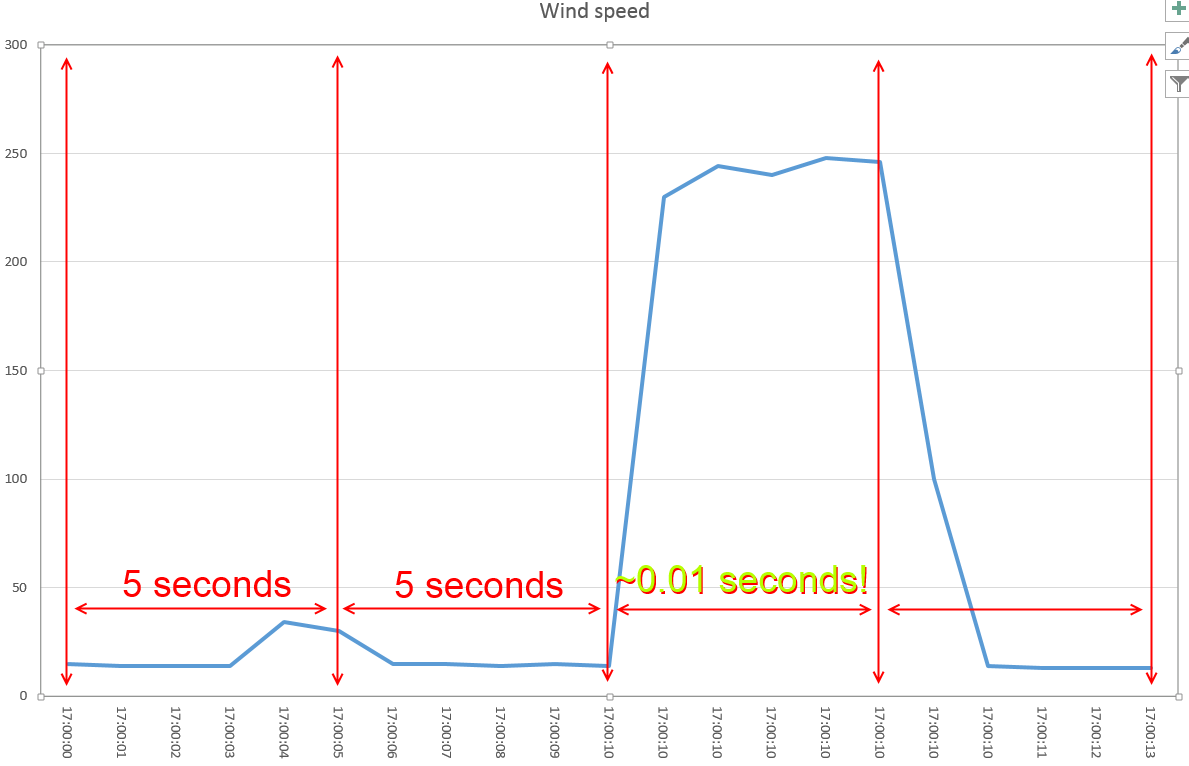
You see the problem here? Even though the legend shows the correct time, just looking at the graph we might not be aware of the data loss. Even worse, we might think that between the two spikes there were only few seconds. This is not good:
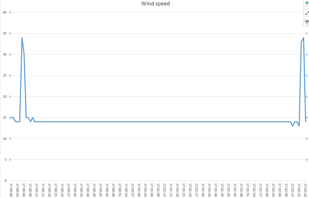
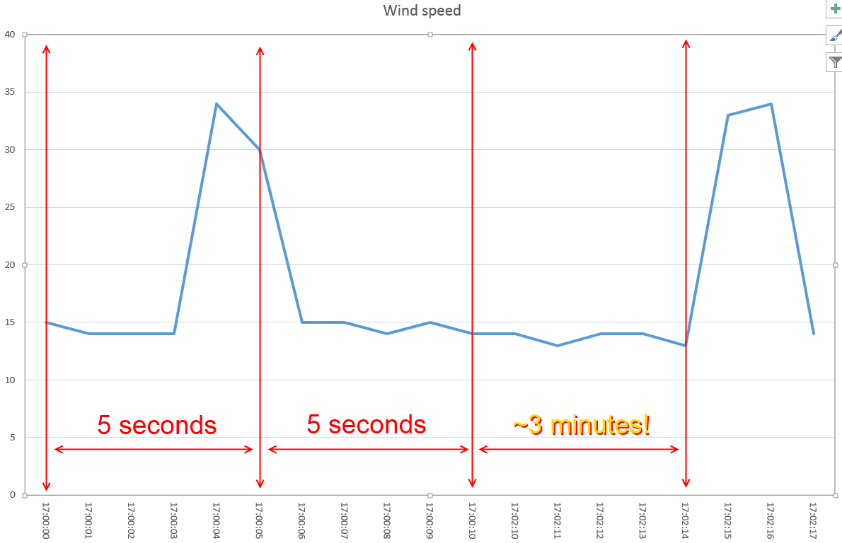 What should we do? There is no right answer; generally I tend to keep the last value until a new one is available. This creates a flat line: it’s clear that something went wrong. It is also clear that minutes passed between a spike and the other:
Now let’s go back to the original dataset:
 This time we receive a flood of data (more than one each second):
This leads to this misleading graph:
We seem to have a huge spike lasting very long! The problem here is – again – that the time scale is not linear:
What can we do in this case? I tend to suggest using the weighted average: this is mathematically correct even though this may cause loss of information. The graph with the linear time will be:
Aside of having a lower spike, it’s also evident that the spike lasted just a few seconds.
A more formal definition of what I’ve done here is kindly given by a contributor who wished to remain anonymous:
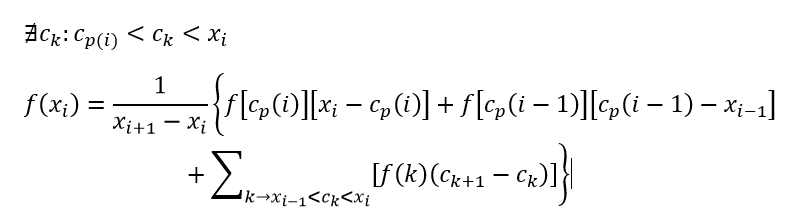
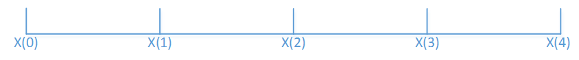
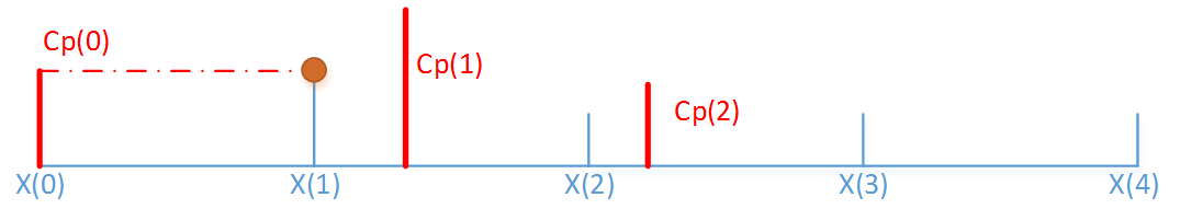
Just to explain a little, consider this simplified example. Given a linear time axis:
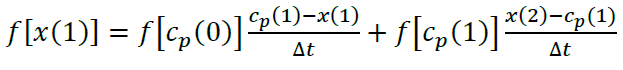
We add two samples at Cp(0) and at Cp(1) . The values are f(Cp(0)) and f(Cp(1)) . The goal here is to get the value at each x(i) .
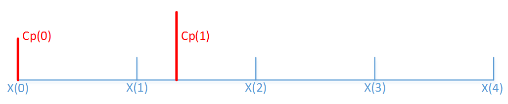
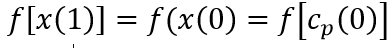
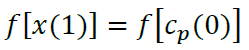
The first sample is exactly at the x(0) . This means that
 .
.
That’s easy.
Now since we don’t have samples between x(0) and x(1) we choose maintain the same value.
This means that
 .
.
In other words we are weighting the value for relative weight in the interval:
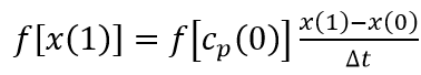 .
.
Of course since x(1)-x(0) is our deltaT, we have:
 .
.
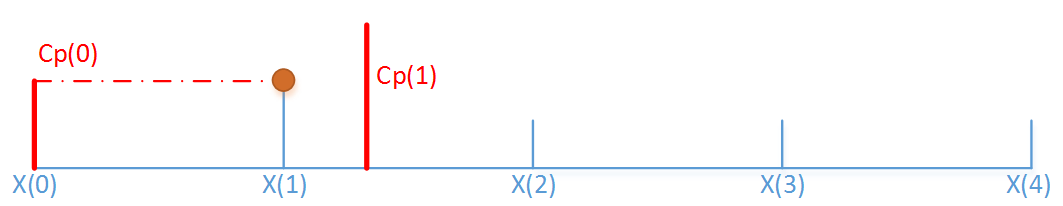
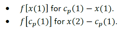
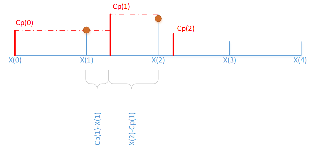
Now, we add another sample Cp(2) . This sample is after x(2) but before x(3) .
What will be the value of f(x(2)) ?
It will be the value of f(x(1)) until a new sample is found (Cp(1) ). From that on will be f(Cp(1)) . To even things out we just need to weight the values for their duration:
Wow. Notice that since:
 we can write the function this way:
 .
.
This is the same as:
 .
.
See what we are getting to? I will not cover here the other scenarios because I think you got the hang of it. The algorithm here is easy: for each period calculate the weighted average of its samples (taking account of the previous sample if need be). The code is very easy indeed:
 public List<DateValuePair> Push(DateValuePair dvp)
        {
            List<DateValuePair> lDVPs = new List<DateValuePair>();

            if (fFirst)
            {
                Start(dvp);

                // Add itself as first event
                lDVPs.Add(dvp);

                return lDVPs;
            }

            DateTime NextStep = CurrentStep.Add(Step);

            while (dvp.Date >= NextStep)
            {
                double dUsedMS = Math.Min((NextStep - CurrentTime).TotalMilliseconds, 1000);
                AccumulatedValue += (dUsedMS * Current.Value) / 1000.0D;
                lDVPs.Add(new DateValuePair(-1) { Date = NextStep, Value = AccumulatedValue });
                AccumulatedValue = 0;

                CurrentStep = NextStep;
                CurrentTime = NextStep;
                NextStep = NextStep.Add(Step);
            }

            double dRemainining = Math.Min((dvp.Date - CurrentTime).TotalMilliseconds, 1000);
            AccumulatedValue += (dRemainining * Current.Value) / 1000.0D;
            CurrentTime = dvp.Date;

            Current = dvp;

            return lDVPs;
        }
We expose a method to be called for each sample. Notice that for each call we may receive an arbitrary number of results. This is expected as we cannot know in advance how many time frames have passed between a sample and the next one.
The algorithm revolves around an accumulator (called AccumulatedValue) that holds the weighted partial value for a given interval. As you can see, I am arbitrarily setting the to 1 millisecond: this should be enough for most scenarios but feel free to change if you need. With the accumulator in place it’s just a matter of looping through the samples until you complete an interval.
Our last task is to expose the method via T-SQL. There are many ways of doing this but given the limitation of SQLCLR dataset passing I opted for using the context connection (see http://msdn.microsoft.com/en-us/library/ms131053.aspx). This is not elegant at all but gets the job done. If you think of a better approach please let me know.
The definition is:
 CREATE FUNCTION [Normalization].TimeNormalize(@statement NVARCHAR(MAX), @days INT, @hours INT, @minutes INT, @seconds INT, @milliseconds INT)
RETURNS TABLE(
 [EventTime]         DATETIME,
   [NormalizedValue]   FLOAT
)
AS EXTERNAL NAME [ITPCfSQL.Azure.CLR].[ITPCfSQL.Azure.CLR.TimeNormalization.TimeNormalizer].TimeNormalize;
GO
As you can see, we should pass this SP the TSQL statement that will produce the dataset to normalize. The dataset must have two columns, the first one being a DATETIME and the second a number. The other parameters specify the time interval used for the normalization. You can go as low as one millisecond (as explained above).
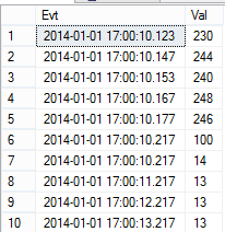
Let’s try a demo. First we create a staging table:
CREATE TABLE tbl(Evt DATETIME, Val FLOAT);
And we put some events in it. The events are hardly evenly spaced:
 INSERT INTO tbl(Evt, Val) VALUES('20140101 17:00:10.000', 0);
INSERT INTO tbl(Evt, Val) VALUES('20140101 17:00:10.123', 230);
INSERT INTO tbl(Evt, Val) VALUES('20140101 17:00:10.145', 244);
INSERT INTO tbl(Evt, Val) VALUES('20140101 17:00:10.153', 240);
INSERT INTO tbl(Evt, Val) VALUES('20140101 17:00:10.165', 248);
INSERT INTO tbl(Evt, Val) VALUES('20140101 17:00:10.175', 246);
INSERT INTO tbl(Evt, Val) VALUES('20140101 17:00:10.215', 100);
INSERT INTO tbl(Evt, Val) VALUES('20140101 17:00:10.218', 14);
INSERT INTO tbl(Evt, Val) VALUES('20140101 17:00:11.218', 13);
INSERT INTO tbl(Evt, Val) VALUES('20140101 17:00:12.218', 13);
INSERT INTO tbl(Evt, Val) VALUES('20140101 17:00:13.218', 13);
Now let’s see our data with the linearized timescale (using our algorithm):
 SELECT * FROM tbl;
SELECT * FROM [Normalization].TimeNormalize('SELECT * FROM tbl', 0, 0,0,1,0);
This gives us:
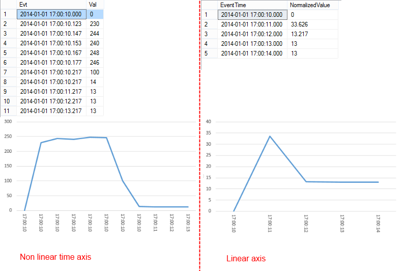 Notice here a how the same starting information we are getting two different graphs: the first one is clearly misleading (look at the scale: it goes up to 500!), the second is much easier to understand. Don’t misunderstand me here: I’m not saying that the first graph is wrong. It is not. It’s just misleading because we expect the graph to have linear axis.
Last demo. Let’s simulate a connection loss. To do so, we just skip some time in our last sample:
 TRUNCATE TABLE tbl;
INSERT INTO tbl(Evt, Val) VALUES('20140101 17:00:10', 14);
INSERT INTO tbl(Evt, Val) VALUES('20140101 17:02:11', 13);
INSERT INTO tbl(Evt, Val) VALUES('20140101 17:02:12', 14);
INSERT INTO tbl(Evt, Val) VALUES('20140101 17:02:13', 14);
INSERT INTO tbl(Evt, Val) VALUES('20140101 17:02:14', 13);
INSERT INTO tbl(Evt, Val) VALUES('20140101 17:02:15', 33);
INSERT INTO tbl(Evt, Val) VALUES('20140101 17:02:16', 7);
INSERT INTO tbl(Evt, Val) VALUES('20140101 17:02:17', 33);
INSERT INTO tbl(Evt, Val) VALUES('20140101 17:02:18', 30);
INSERT INTO tbl(Evt, Val) VALUES('20140101 17:14:17', 14);
SELECT * FROM tbl;
SELECT * FROM [Normalization].TimeNormalize('SELECT * FROM tbl', 0, 0,0,1,0);
This is the result (notice I’ve blurred the normalized values just because they are too many):
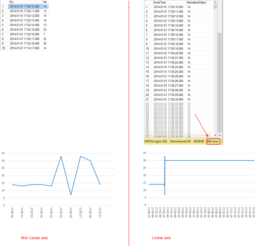
The two graphs are once again very different.
Long story short: just because a graph is correct don’t assume the viewer will interpret it in the right way. Sometimes it’s best to help him a little, even if that means blending information.
PS: I’ve almost forgot to mention: you will find the method (along with the stored procedure) for free in the Microsoft SQL Server To Windows Azure helper library (https://sqlservertoazure.codeplex.com/) open source library.
Happy Coding,