Using Chart.js with REST in SharePoint 2013
[caption id="attachment_276" align="aligncenter" width="1024"]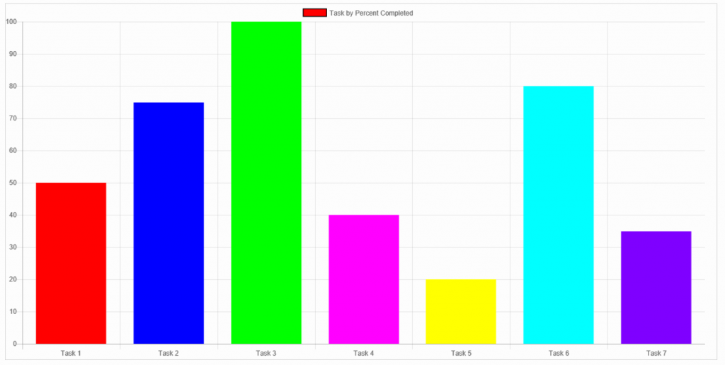 Task by Percent Completed[/caption]
In a previous post I wrote about how to include Chart.js into a SharePoint page. Chart.js is a great tool to chart data. In the first blog the data was constant and hard coded into the script. In this article I include data that is a bit more dynamic, data that is in motion, data that is a bit more SharePoint-like-- a SharePoint Task List.
I will also introduce three new concepts: REST, jQuery and JSLink. When you combine REST and JSLink magic happens inside of SharePoint. It's like fizz in a soft drink, like gun powder inside the firecracker, like.. well you get the point- magic happens!
To get introduced to both concepts you can find information in the following links:
This articles picks up where the other one left off so I am not going to spend time configuring the page and setting up the libraries. You can go back to Using Chart.js in SharePoint 2013 if you have not done so just yet.
In my previous post, the JavaScript was simple and easy. After all, Chart.js is the one that is doing all the heavy lifting. The JavaScript looked like this:
The new version of this script looks similar when it comes to Chart.js. As a matter of fact, the only thing that changes is the dataset that gets build dynamically and the colors that I use in the chart. To begin creating our dataset I use the jQuery.ajax() call to query the Task List I am working with.
$.ajax({ url:"/_api/Web/Lists/getbytitle('task%20list%20example')/items?$select=Title,Status,PercentComplete", type: "GET", headers: { "Accept": "application/json;odata=verbose" }, success: successHandler, error: errorHandler });
Although the $.ajax() call above is full of nuggets (and I will walk through as many as I can), the key point to take from the above code is that the jQuery.ajax() call is an asynchronous request to my task list. What is Ajax? Ajax stands for Asynchronous JavaScript and XML. Its main function is to load and display data in the background without reloading the entire page. In other words, the function is doing is thing in the background… while everything else loading and rendering. Kind of cool, eh?
Enter REST endpoints. If you were to take the above REST Endpoint and drop in the URL bar of your browser, you should get back some information. In fact, that is one sure way to make sure that you are getting back the data you need. If the page that comes back doesn't have the data you need, then you need to modify your request. In my request above, I use a select statement to get me what I need, in this case I just need the "Title", "Status", and "PercentComplete" fields.
$select=Title,Status,PercentComplete"
Like most http request, we are setting the "Type" as a "Get" request:
type: "GET"
I am also setting the headers to return the data we need in JSON (JavaScript Object Notation) format. This means that our data will come back to us as a collection of Name/Values pairs.
headers: { "Accept": "application/json;odata=verbose" },
Finally we have the functions that are called depending on the success of the $.ajax() call:
success: successHandler, error: errorHandler
I am only going to concentrate on the successHandler() function because this is where I manipulate the data to fit the needs that Chart.js requires. Not to be left behind, however, the errorHandler() function is an important function as well. You can do a lot of things, and you should, if your request happens to fail.
Let's get started on the successHandler().
function successHandler(data){ var myDataSet = data.d.results; var myLabels = []; var myData = []; $(myDataSet).each(function() { myLabels.push(this.Title); myData.push((this.PercentComplete * 100)); }); myData.push(0); // creates a '0' index on the graph
To start, as already mentioned, the successHandler() function is only called when the $.ajax() call is successful. This means that the request was able to query the REST endpoint and now has a result set, a collection of the data we requested. This collection, this data is then passed to the successHandler() function in the way of the "data" parameter.
function successHandler(data){
Because the data collection that we get back from the server has a lot of metadata we are not going to use we have to drill into the collection and get only what we need. Because of this I declare a variable that will hold the Name/Value pairs I need.
var myDataSet = data.d.results;
If you look closely at the first article or the Chart.js documenation, it requires an array that hold the values for the "Labels" and the "Data" that will be graphed. Because of this we declare two new arrays, name them accordingly and start populating them by looping through the data collection.
var myLabels = []; var myData = []; $(myDataSet).each(function() { myLabels.push(this.Title); myData.push((this.PercentComplete * 100)); }); myData.push(0); // creates a '0' index on the graph
Now that we have our arrays populated we need to instruct Chart.js to use them. To do this, I first have to get the canvas that Chart.js uses to create the graphs. Again, this information will be found on the previous blog. We also tell Chart.js what type of graph we are looking to create. In this example we are using the bar graph.
var ctx = document.getElementById('myChart').getContext('2d'); var chart = new Chart(ctx, { // The type of chart we want to create type: 'bar',
In the following code, there are three things that I will cover. These three settings are what make Chart.js do what it does. In a nutshell we assign myLabels (our custom array that we created and populated above) to labels. We create a title for our graph by setting the label setting: label: "Task by Percent Completed". We set the colors that each bar will use, also an array and finally we assign myData array to the data setting.
data: { labels: myLabels, datasets: [{ label: "Task by Percent Completed", backgroundColor: ['rgb(255, 0, 0)','rgb(0,0,255)','rgb(0,255,0)','rgb(255,0,255)','rgb(255,255,0)','rgb(0,255,255)','rgb(127,0,255)'], borderColor: 'rgb(0, 0, 0)', data: myData, }] },
After it is all said and done, you should have created a graph using data from a SharePoint list. The complete code is below:
$.ajax({ url:"https://army.deps.mil/NETCOM/sites/106SB/SharePointTraining/ms/_api/Web/Lists/getbytitle('task%20list%20example')/items?$select=Title,Status,PercentComplete", type: "GET", headers: { "Accept": "application/json;odata=verbose" }, success: successHandler, error: errorHandler });function successHandler(data){ var myDataSet = data.d.results; var myLabels = []; var myData = []; $(myDataSet).each(function() { myLabels.push(this.Title); myData.push((this.PercentComplete * 100)); }); myData.push(0); // creates a '0' index on the graph var ctx = document.getElementById('myChart').getContext('2d'); var chart = new Chart(ctx, { // The type of chart we want to create type: 'bar', data: { labels: myLabels, datasets: [{ label: "Task by Percent Completed", backgroundColor: ['rgb(255, 0, 0)','rgb(0,0,255)','rgb(0,255,0)','rgb(255,0,255)','rgb(255,255,0)','rgb(0,255,255)','rgb(127,0,255)'], borderColor: 'rgb(0, 0, 0)', data: myData, }] }, // Configuration options go here options: {} }); };