Using Time Intelligence for Dynamic Filters with Service Manager 2012 OLAP Cubes - Part 2
In my previous blog post Using Time Intelligence for Dynamic Filters with Service Manager 2012 OLAP Cubes - Part 1 I discussed creating the Data Source, adding the Time Intelligence source and creating the filter. In this post we will focus on creating a KPI, a Score Card and a Dashboard.
Configuring the Dashboard
The first thing we will create is the KPI (Key Performance Indicator). KPI's are measurements of performance, in Service Manager this can be measurements such as Incident Resolve Rate, Average time to Resolve, etc. While you can create KPI's directly in the Service Manager Analytic Cubes, for this demo we will manually create them with PerformancePoint.
KPI
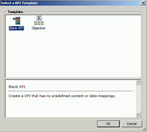
- Right click PerformancePoint Content, click New and click KPI. We will be using the Blank KPI template in this demonstration.
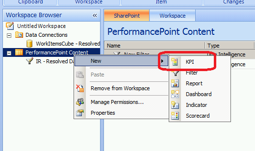
2. Call the KPI Incident Resolve Rate
There are multiple sections to a KPI in PerformancePoint:
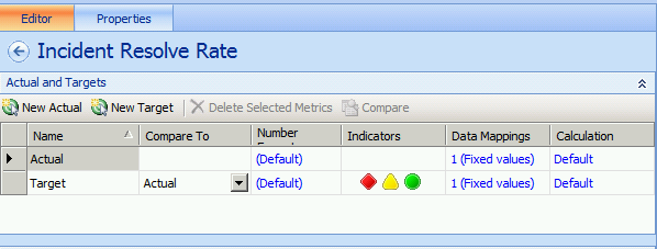
- Actual - This is the actual value, so in our situation it would be Incidents Resolved/Incidents Opened.
- Target - This is your goal or threshold
- Number Format - This is the format of the number for Actual and Target, for this demonstrations purpose we will choose Percentage since we are looking for a rate.
- Indicators - This is were we define our icons or indicators (stop sign, traffic light, gauge, etc) but this is also where we will set the scoring pattern for the KPI.
- Data Mappings - This element is used to define where the data is coming from.
- Calculation - This determines how the KPI is calculated.
3. To begin click Number Format for Target and Actual and choose Percentage, then click on 1 (Fixed values) on the Actual row, and click Change Source...
4. Click on the Calculated Metric tab and choose Blank Calculation and click Ok.
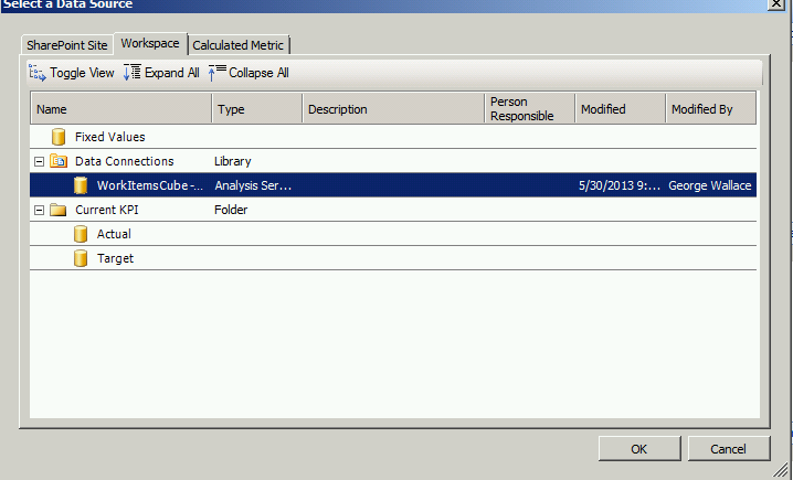
5. Click 1(Fixed values) on the first row and click Change Source...
6. Choose the Data Source we configured in Part 1 and click OK
7. Pull down the Select a measure drop-down and choose Incidents Resolved Count and click OK
** At this point you can add a Dimension to slice to slice the data by or even a Time Intelligence Filter, but for the sake of this demonstration we will use neither. **
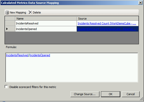
8. Do the same for the 2nd row but this time choose IncidentDimCount.
9. Rename the rows to IncidentsResolved and IncidentsOpened. In the Formula field type IncidentsResolved/IncidentsOpened and click OK.
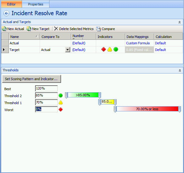
10. Now click on 1(Fixed values) on the Target row. For the Value enter .85 (Since we are calculating a percentage) 85% will be our target, but this will ultimately be whatever the KPI target is defined for your organization.
11. In the Thresholds window change Threshold 2 to 85% and change Threshold 1 to 70%
Scorecard
- Right click PerformancePoint Content click New and choose Scorecard
- Uncheck Use wizards to create scorecards under Wizard option: and click OK.
3. Rename your scorecard to Incident Score Card.
4. Expand KPIs , PerformancePoint Content and drag the KPI we created earlier to the left column and click the Save button.
You should now have a Score Card that looks similar to below. As you can see I have closed 60% of my Incidents, which is in the Yellow Threshold and I am 29% off of target. Keep in mind when viewing Score Cards in Dashboard designer Time Intelligence filters are not applied.

5. Now Right Click PerformancePoint content and click New and click Dashboard

6. Choose Header, 2 Column and click Next.
7. Give the Dashboard a name and also give the Page a name. Dashboards can have multiple pages that can be spanned with Hyperlinks to allow you to switch between them, but that is out of scope for this exercise.

8. From the Details pane drag your Filter to the Header field and the Score Card to the Left Column.

9. Now it is time to link the Filter to the Score Card. Click the Down Arrow on the Filter and choose Create Connection

10. Under Send Values to: choose your Score Card as it is the only item available. ** Keep in mind filters that be tied to multiple objects at the same time.

11. Click on the Values tab. Under the Connect to drop down, you will see Axis, Row, Column, TI Formula, and Current date-time. In this example the only 2 that will work without throwing an error are Page and Column. The difference between them are that Page will only show 1 element, whether or not data is aggregated, Column dependent on the Filter, if it is an aggregation like month:month-2 which shows the Current month and 2 months prior, each month will be its own Column. For this we will choose Column

12. Under Source Value you have the choice of Display Name, Member Unique Name, Formula, and the time filter itself. When leveraging Page or Column you must use Member Unique Name.

13. Click OK and Save your Dashboard. Right click the Dashboard and click Deploy to SharePoint.

14. Expand your Site, click Dashboards and click OK.

Now you have a working Dashboard using Dynamic Time Intelligence Formulas.

As you can see by picking a Filter Item such as Previous Week you get data for each day displayed. This is great as you can now look at trends of data over a time period.

In Part 3 I will discuss how you can leverage the Time Intelligence Filters on other items like Analytic Grids.