Creating a Custom Report for System Center 2012 R2 Configuration Manager – Part 4
Creating the Summary Tables
In Part 3 the dataset were created. We’ll now take the data and place them into the tables and charts.
- Click the Insert tab --> click Table --> Insert Table
- Draw a table below the title
- A default table with 3 columns will appear
- Hover over the bottom row of the first column
and click the little notepad icon symbol that appears - Select the Dataset --> Select Collection_Details --> Select Name
- Click Next
- Add Devices to the next column and the scanned_last_30_days to the last column
- Right click the top of the last column --> Select Insert Column --> Select Right
- Add Inventory_last_30_Days to the last column
- Right click the bottom row in the Devices column
- Select fx Expression
- Change the expression from =Fields!Devices.Value to =SUM(Fields!Devices.Value)
- Repeat this step for the Scanned_last_30_Days
and Inventory_last_30_Days column - Right click the bottom row of any column
- Notice the orange bracket in the first column
- Select Row Group --> Delete Group
- Select Delete group only--> Click OK
- This disables the looping ability of the table and the orange bracket will disappear
The table should look like this:

Press F5 to run the report to see if it is working properly
- Create another table and place it under the one just created
- Right click the bottom row of any column
- Select Row Group --> Delete Group
- Select Delete group only --> Click OK
- Hover over the bottom row of the first column and click the little notepad icon symbol that appears
- Select the Dataset-> Software_Update_Details --> Title
- Hover over the bottom row of the second column and click the little notepad icon symbol that appears
- Select Software_Update_Details --> Status
- Hover over the bottom row of the third column and click the little notepad icon symbol that appears
- Select Software_Update_Details --> Status
- Create a new column
- Hover over the bottom row of the forth column and click the little notepad icon symbol that appears
- Select Software_Update_Details --> Deployed
- Hover over the bottom row of the forth column and click the little notepad icon symbol that appears
- Create a new column
- Select Software_Update_Details --> Deployed
- Right click the last row in the first column --> Select fx Expression
- Change the expression to =Count(Fields!Title.Value)
- Right click the last row in the second column --> Select fx Expression
- Change the Expression to =SUM(IIF(Fields!Status.Value = "Required",1,0))
- Right click the last row in the third column --> Select fx Expression
- Change the expression to =SUM(IIF(Fields!Status.Value = "Installed",1,0))
- Right click the last row in the fourth column --> Select fx Expression
- Change the expression to =Sum(IIF(Fields!Deployed.Value = "Yes", 1, 0))
- Right click the last row in the fifth column --> Select fx Expression
- Change the expression to =Sum(IIF(Fields!Deployed.Value = "No", 1, 0))
The table should look like this:

Press F5 to run the report to see if it is working properly
Creating the Operating System Pie Chart
- Click the Insert tab --> Click Chart --> Chart Wizard
- The New Chart window will appear
- Select the All_OperatingSystems dataset
- Click Next
- Select the Pie Chart
- Click Next
- Place Operating_System in the Series
- Place Number_of_Systems in Values
- Click Next
- Select the Ocean style
- Click Finish
- Right click the Pie chart --> Select Show Data Labels
- Rename the Chart Title to Operating Systems
Press F5 to run the report to see if it is working properly
Creating the Line Chart
- Click the Insert tab --> Click Chart --> Chart Wizard
- The New Chart window will appear
- Select the Software_Update_Details dataset
- Click Next
- Click the Line Chart
- Click Next
- Add Count(DatePosted) in Values
- Add Status in Series
- Add DatePosted in Categories
- Click Next
- Select the Ocean style
- Click Finish
- Right click the chart --> Select Show Data Labels
- Click off the chart then right click it again
- The Chart Data Properties should appear next to it
- Under Category groups right click DatePosted
- Select Category Group Properties…
- Click the Fx button for the Label
- Change the Expression to =Format(Fields!DatePosted.Value, "MMM yy")
- Click OK
- Click the fx button for the group
- Change the Expression to =MonthName(Month(Fields!DatePosted.Value))
Press F5 to run the report to see if it is working properly
To make the Required line red follow these steps:
Click the View tab
Select Properties
Click off then back on to the chart
In the properties pane under Chart look for CustomPaletteColors
Click the … button for the CustomPaletteColors collection
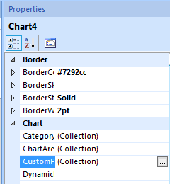
Change the color in row #1 (it starts at 0) to Red
Press F5 to run the report to see if it is working properly
Creating the Severity Chart
- Click the Insert tab --> Click Chart --> Chart Wizard
- The New Chart window will appear
- Select the Software_Update_Details dataset
- Click Next
- Click the Column Chart
- Click Next
- Add Status in Series
- Add Severity in Categories
- Add Count(Severity) in Values
- Click Next
- Select the Ocean style
- Click Finish
- Right click the chart --> Select Show Data Labels
Creating the Category Chart
- Click the Insert tab --> Click Chart --> Chart Wizard
- The New Chart window will appear
- Select the Software_Update_Details dataset
- Click Next
- Click the Column Chart
- Click Next
- Add Status in Series
- Add Count(CategoryInstanceName) in Values
- Add CategoryInstanceName in Categories
- Click Next
- Select the Ocean style
- Click Finish
- Right click the chart -->Select Show Data Labels
Creating the Software Update Table
Adding in the list of all applicable updates doesn’t fit in with the concept of a dashboard but it is good information to see.
- Create another table and place it under the charts
- Hover over the bottom row of the first column and click the little notepad icon symbol that appears
- Select the Dataset --> Software_Update_Details --> Count
- Continue to add in the columns for each field returned from the dataset
To add sorting to the columns follow these steps:
- Right click a column header --> Select Text Box Properties…
- The Text Box Properties window will appear
- Select Interactive Sorting
- Check Enable interactive sorting on this text box
- Select the column to be sorted in the Sort by selection
- Repeat this for each column you want to allow sorting on
Press F5 to run the report to see if it is working properly
You should now have a dashboard to give you a quick view of overall software update status. Although you may not use this dashboard in its entirety, you can create your own custom queries to satisfy your own requirements and gain more out of one the most powerful but underused features of ConfigMgr 2012.
I purposely didn't update the top right text box. Based on the steps within this demonstration, see if you can have it display the start month, start year, end month and end year.
Creating a Custom Report for System Center 2012 R2 Configuration Manager – Part 1
Creating a Custom Report for System Center 2012 R2 Configuration Manager – Part 2
Creating a Custom Report for System Center 2012 R2 Configuration Manager – Part 3
Creating a Custom Report for System Center 2012 R2 Configuration Manager – Part 4
Creating a Custom Report for System Center 2012 R2 Configuration Manager – Part 5