SCOM and Power View: Alert Duration Analysis
I use the SCOM Data Warehouse model for a variety of administrative and analytical activities. Sometimes, I add a dataset to meet a specific purpose. Besides reviewing the volume and frequency of alerts I might look at their duration (the difference between the time raised and the time closed) in order to tune them. Most commonly, I would increase the notification delay for alerts which quickly resolve themselves or override the severity to make the alert informational.
Power View supports key performance indicators (KPIs) for tables and matrices. For this scenario, I will create some measures and convert the average duration into a KPI. To make the most of the interaction between charts I will use different perspectives to gain an understanding of the alert behavior. In order to get these perspectives I added configuration data to the SCOM DW model as I did with the performance model.
Overview
A. Add Alert State Dataset to SCOM DW Model
B. Create Columns, Measures and KPI for Alert Duration
C. Create Alert Duration Report View
Step by step
A. Add Alert State Dataset to SCOM DW Model
Open SCOM DW Model in Excel
Click Manage in the Data Model section of the ribbon in the POWERPIVOT menu

Click Existing Connections in the Get External Data section of the ribbon in the Home menu

Select the SCOM_DW from the PowerPivot Data Connections
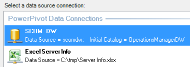
Click Open
Select Write a query that will specify the data to import
Click Next >
Add the following query
--Alert State
SELECT ARS.AlertGuid
,ARS.ResolutionState
,ARS.TimeInStateSeconds
,ARS.TimeFromRaisedSeconds
,ARS.StateSetDateTime
,ARS.StateSetByUserId
,ARS.DWCreatedDateTime
FROM Alert.vAlertResolutionState ARS
INNER JOIN Alert.vAlert AL on AL.AlertGuid = ARS.AlertGuid
WHERE AL.RaisedDateTime >(GETUTCDATE() - 7)
Enter Alert State in the Friendly Query Name: field
Click Finish
Click Close when the import completes successfully
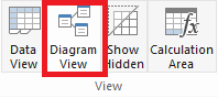
Click the Diagram View in the View section of the ribbon
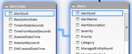
Resize and arrange the datasets
Create a relationship by clicking and dragging the field in the From column to the field in the To column
From
To
Alert State: AlertGuid
Alerts: AlertGuid
B. Create Columns, Measures and KPI for Alert Duration
Click Data View from the View section of the ribbon
Add columns to the Alert State dataset and rename them
DAX
Column Name
=SWITCH([ResolutionState],255,"Closed",0,"New",249,"Acknowledged",248,"Assigned to Engineering",247,"Awaiting Evidence",254,"Resolved",250,"Scheduled")
ResState_Name
=[TimeFromRaisedSeconds]/60
TimeFromRaisedMinutes
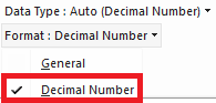
Change the format for the TimeFromRaisedMinutes to Decimal Number in the Formatting section of the ribbon
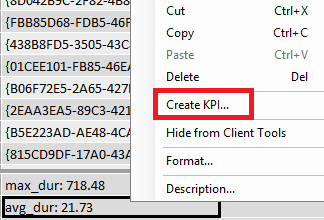
Click an empty field in the section below the data columns
Enter max_dur:=MAX([TimeFromRaisedMinutes]) in the function field (right below the ribbon) to create a measure

Add additional measures for other statistics
Measure Name and DAX
avg_dur:=AVERAGE([TimeFromRaisedMinutes])
min_dur:=MIN([TimeFromRaisedMinutes])
alert_count_rs:=DISTINCTCOUNT([AlertGuid])
Change the format for max_dur, avg_dur, and min_dur to Decimal Number in the Formatting section of the ribbon
Right click on avg_dur and select Create KPI…
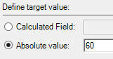
Select Absolute value: under Define target value:
Enter 60 in the Absolute value: field
Enter 5 in the slider field between the red and yellow ranges and 15 in the slider field between the yellow and green ranges
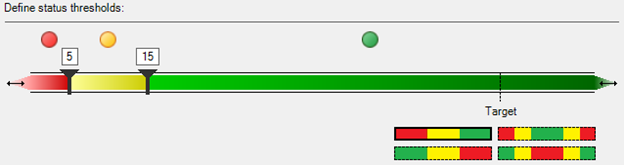
Click OK
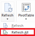
Select Refresh All from the Refresh pulldown in the ribbon in the Home menu
Click Close when the refresh is complete
Close the Power Pivot window
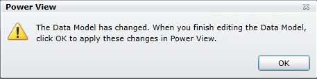
Click OK in the Power View dialog window
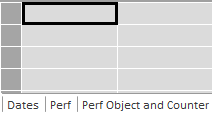
C. Create Alert Duration Report View
Click Power View From the Insert section of the ribbon in the POWER VIEW menu
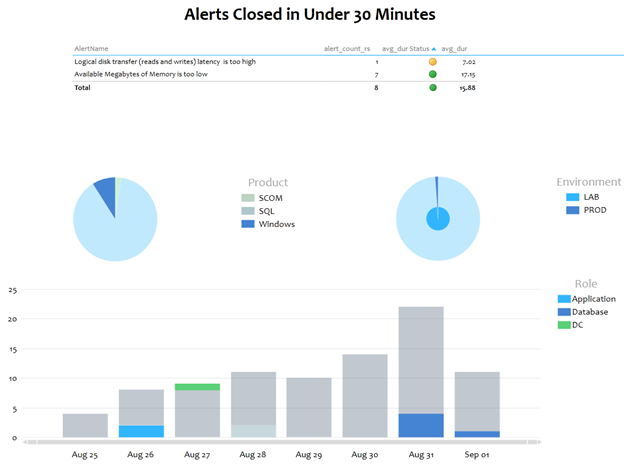
Enter Alerts Closed in Under 30 Minutes in the Click here to add a title field
Adjust the text if desired
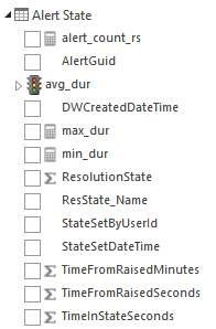
Expand the Alert State dataset
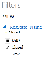
Drag the ResState_Name field from the Alert State dataset into the Filters section
Select Closed
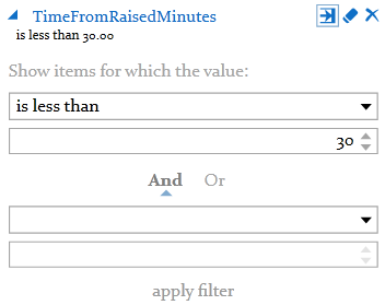
Drag the TimeFromRaisedMinutes field from the Alert State dataset into the Filters section
Change to the Advanced filter mode, select is less than, enter 30, and click apply filter
Expand the Entities dataset
Drag the TLMEType field from the Entities dataset into the Filters section
Select Windows Computer
Expand the avg_dur field in the Alert State dataset
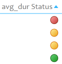
Select alert_count_rs, avg_duràStatus and avg_dur à Value from the Alert State dataset
Expand the Alerts dataset
Select AlertName from the Alerts dataset
Select FQDN from the Entities dataset
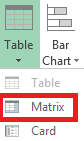
Select Matrix from the Table pulldownfrom the Switch Visualization section of the ribbon
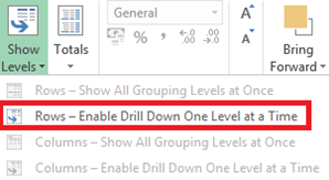
Select Rows – Enable Drill Down One Level at a Time from the Show Levels pulldown in the Options section of the ribbon
Click on the avg_dur Status column to sort from red to green
Click in the open report view space
Select alert_count_rs from the Alert State dataset
Expand the MP Product dataset
Select Product from the MP Product dataset
Select Pie from the Other Chart pulldown in the Switch Visualization section of the ribbon
Select None from the Title pulldown in the Labels section of the ribbonin the Layout menu
Expand the pie chart to half the width of the report view
Change the sort order of the pie chart to use alert_count_rs in descending order
With the pie chart selected press Ctrl-C then Ctrl-V to cut and paste
Click ALL in the Power View Fields section
Expand the Server Info dataset
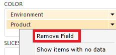
Drag the Environment field from the Server Info dataset to the COLOR section
Select Remove Field from the pulldown for the Product field in the COLOR section
Align the pie charts with room for a column chart underneath
Click in the open report view space
Select alert_count_rs from the Alert State dataset
Expand the Alerts dataset
Select Date from the Alerts dataset
Select Stacked Column from the Column Chart pulldown in the Switch Visualization section of the ribbon
Select None from the Title pulldown in the Labels section of the ribbonin the Layout menu
Drag the Date+Hour field from the Alerts dataset below the Date field in the AXIS section
Drag the Role field from the Server Info dataset to the LEGEND section
Resize the column chart
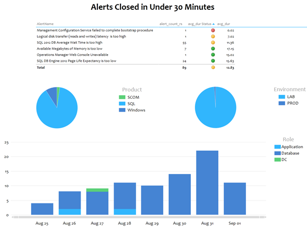
Click on parts of the charts or legends to highlight areas of interest (for example, the Windows alerts)
Rename the tab to Short Alerts
Save the workbook