在Microsoft Dynamics CRM 2011中美化Chart
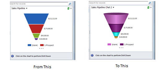
上一篇博客中,我们谈到如何来自定义chart以满足更多的商业需求,在这篇博客中,我们将继续讨论chart,给出一个实例,介绍如何让chart变得更美观。
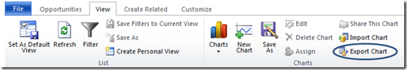
导出Chart
所有的Chart都是基于实体的。打开你的chart所基于的实体。在销售流程中,我们选择Opportunities实体。接下来,确保目前显示的是你想要修改的chart。选择好chart后,点击View页,然后点击Export Chart。这样,就可以将XML文件存到本机,从而进行编辑。
编辑XML
以下是完整的chart文件。注意高亮的部分-我们将着重讨论。
 <visualization>


  <visualizationid>{87293554-2482-DE11-9FF3-00155DA3B012}</visualizationid>


  <name>Sales Pipeline Chet 2</name>


  <description>Shows the sum of estimated revenue in each stage of the sales pipeline.</description>


  <primaryentitytypecode>opportunity</primaryentitytypecode>


  <datadescription>


    <datadefinition>


      <fetchcollection>


        <fetch mapping="logical" count="10" aggregate="true">


          <entity name="opportunity">


            <attribute name="estimatedvalue" aggregate="sum" alias="sum_estimatedvalue" />


            <attribute name="stepname" groupby="true" alias="stepname" />


            <order alias="stepname" descending="false" />


          </entity>


        </fetch>


      </fetchcollection>


      <categorycollection>


        <category>


          <measurecollection>


            <measure alias="sum_estimatedvalue" />


          </measurecollection>


        </category>


      </categorycollection>


    </datadefinition>


  </datadescription>


  <presentationdescription>


    <Chart Palette="None" PaletteCustomColors="218,112,214; 128,0,128; 0,255,255; 218,165,32; 49,171,204; 255,136,35; 97,142,206; 209,98,96; 168,203,104; 142,116,178; 93,186,215; 255,155,83">


      <Series>


        <Series ShadowOffset="0" IsValueShownAsLabel="true" Font="{0}, 9.5px" LabelForeColor="59, 59, 59" ChartType="Funnel" CustomProperties="FunnelLabelStyle=Outside, FunnelNeckHeight=0, FunnelPointGap=1'>


          <SmartLabelStyle Enabled="True" />


        </Series>


      </Series>


      <ChartAreas>


        <ChartArea>


          <Area3DStyle Enable3D="True" />


        </ChartArea>


      </ChartAreas>


      <Legends>


        <Legend Alignment="Center" LegendStyle="Table" Docking="right" Font="{0}, 11px" ShadowColor="0, 0, 0, 0" ForeColor="59, 59, 59" />


      </Legends>


      <Titles>


        <Title Alignment="TopLeft" DockingOffset="-3" Font="Segeo UI, 13px" ForeColor="0, 0, 0"></Title>


      </Titles>


    </Chart>


  </presentationdescription>


  <isdefault>false</isdefault>


</visualization>
编辑XML (非颜色修改部分)
找到<name>行,给你的chart取一个唯一名称。
<name>Sales Pipeline Chet 2</name>
Area3Dstyle默认是设为False,将其设为True以显示3D效果。
<Area3DStyle Enable3D="True" />
编辑XML (颜色修改部分)
<Chart Palette="None" PaletteCustomColors="218,112,214; 128,0,128; 0,255,255; 218,165,32; …
Area3的颜色是RGB格式,三个整数取值范围为0到255,分别代表红、绿、蓝的饱和度。颜色是以图表中颜色从上到下排列。每三个数字代表一个颜色(在这个例子中,218,112,214是第一个颜色)。我们不可能记得成千上万的颜色组合,所以可以参考这个网站,它上面列出了500种常用的颜色。https://cloford.com/resources/colours/500col.htm
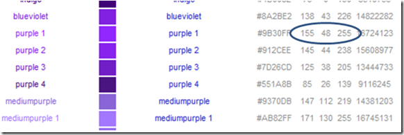
在圈中的三个数字就是对应颜色的RGB值。将所期望颜色对应的数字填入即可。
导入Chart
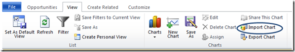
回到实体页面,在View页中选择Import Chart。如果你没有修改过chart的名字,会跳出对话框,让你选择覆盖以前的chart或者创建新的chart。如果你给chart取过唯一的名称,它会被加载并立即显示。
谢谢
Jackie Chen(陈攀)