Facebook Data Analytics with Power BI
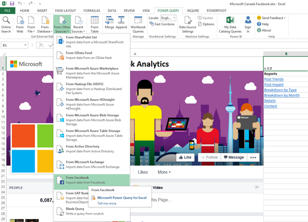
Can you analyze social network data in Excel? The answer might surprise you, but yes! The key is Power Query’s Facebook connector!
Scenario
Now let’s consider an actual scenario! Let’s do the analysis of Microsoft Canada’s Facebook page. The file is available for download below.
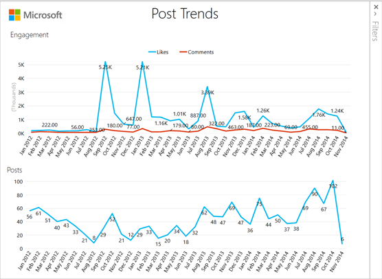
First let’s look at the post trend Power View sheet. Three things stand out:
-
Peaks of engagement Sep 2012, Jan 2013, Aug 2013
Higher average engagement since July 2014
General increase in the number of posts per month over the last two years
Let’s investigate further these points: With the increasing number of posts, is the average post impact decreasing?
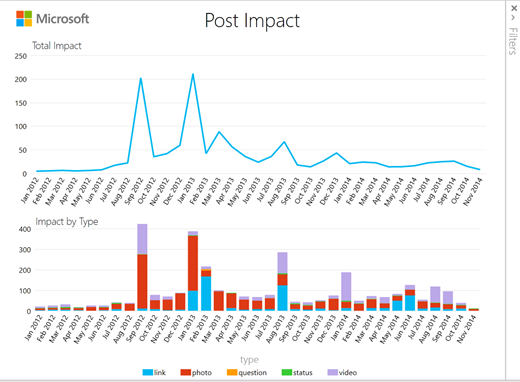
Post Impact
Impact is defined as the average number of likes, comments, shares per post
When we look at the average impact of each post we see that it’s going down and getting very low
The August 2013 peak is not as pronounced here meaning that it is more likely an outlier and partially explained by the higher total number of post done that month
Pictures and Videos seem to be having the most impact, but what is the current mix of posts and is it optimal?
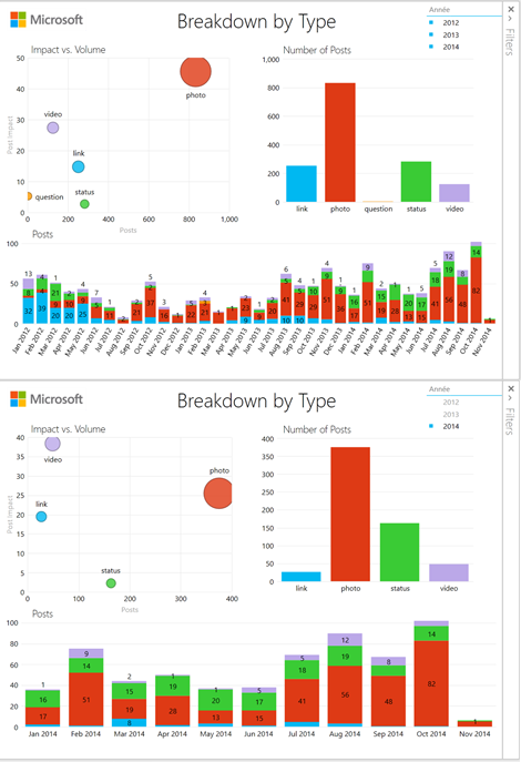
Breakdown by Type
The dashboard shows clearly that pictures have the most impact followed by videos.
If we filter on year 2014 using the slicer, we observe that videos overtook pictures as posts with the most engagement.
We also observe that there is a high volume of status updates (second in number of posts after pictures), but at the same time status updates get almost no engagement.
Channel managers would thus generate more engagement by changing the mix of posts to replace status updates by pictures, videos or link posts.
Now what explains the two peaks of engagement we observed earlier? (Sep 2012, Jan 2013)
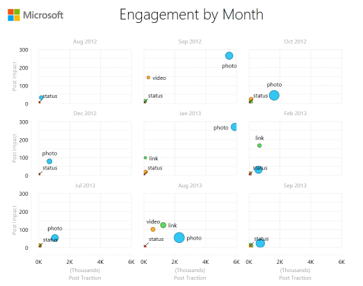
By Month
The dashboard is filtered to focus on the three peaks (Sep 2012, Jan 2013, Aug 2013) and the months before and after. Thus the center column shows the peaks.
For the first two peaks we see that pictures represent the most engagement whereas the third one is a mix of multiple things.
Why pictures had more engagement those two months?
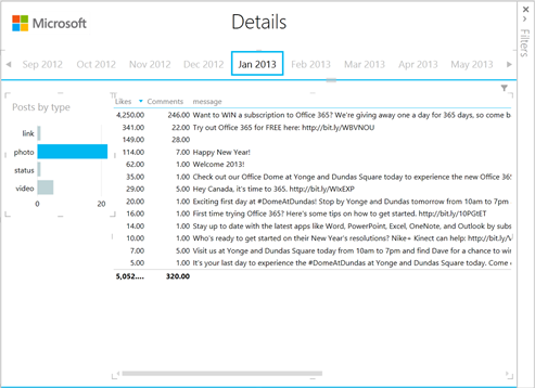
Details
We now use the details dashboard to identify which posts in particular had the most engagement.
Navigating to Jan 2013 and filtering on pictures tells us that the main reason why engagement increased was that a contest was going on that month to win an O365 subscription.
What’s the impact of contests on engagement?
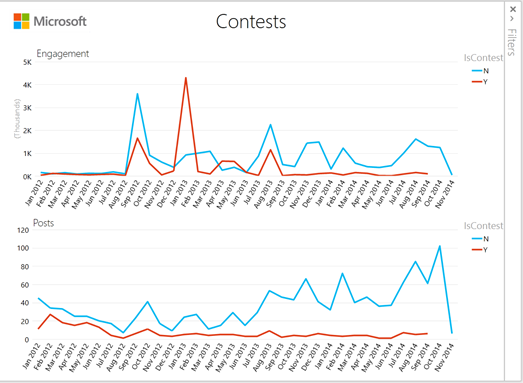
Contests
The final dashboard shows the engagement and posts of contests vs. non-contest.
A post is defined as a contest if it contains the word “contest” or “win.”
We observe that the whole peak of Jan 2013 is explained by a contest as well as half of Sep 2012 and Aug 2013 is explained likewise by contests.
Conclusion
Now that we’ve looked at the information here’s a few things the communication department could look at:
Optimize the type mix of Facebook posts by reducing the use of status updates.
Investigate running more contest on this channel to maximize engagement if the ROI can be justified.
Use Post Impact as metric for success rather than Total Engagement as successful campaigns stand out more this way.
In my next blog post I’ll explain how to refresh this analytics for your own Facebook page!