Scaling – The art of telling a story
Technorati Tags: perfmon
Like with any statistics, you can tell any story you want. I can make any graph emphasize the point I want by scaling appropriately. The story I want to tell is going to make it simple to understand the data and the correct course of action that should be taken (which you will also recommend).
I pondered whether I should first blog about how to scale or initially show you the power of proper scaling. Since I could not decide, I flipped a coin and showing the power and value of proper scaling won. My next blog will be a step by step on how to scale.
Here is a brief synopsis of the issue I am using for this example: End users where having a perceived performance issue while authenticating with a Domain Controllers. The issue was intermittent. They were not positive that the performance degradation was really within AD communications, so they wanted to gather some evidence. After a few attempts, the customer was finally able to capture data during an issue and record the exact times 3:40pm and 4:40pm when it happened.
The three pictures below are all showing the same data, just with different scaling. Can you guess which one I shared with the customer’s management?
picture 1
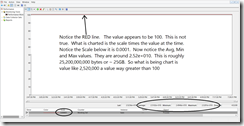
The above chart is a simple load of the counter. No scaling has been applied. When I teach Vital Signs in every class I have at least one student that asks: “Why are all my values 100 on the chart? Why don’t they look like your chart?” The answer is they have not scaled counter on the chart. This chart has no value in telling a story and by itself is useless in doing an analysis.
picture 2
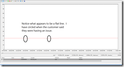
The second picture is a simple auto scale of the data. As you can see the value looks mostly like a flat line. 99.9% of the engineers looking at this data would not see any issue. There does not appear to be any upward/downward trends on the graph. In fact, I looked at this data for hours before I decided to rescale what I was seeing.
picture 3
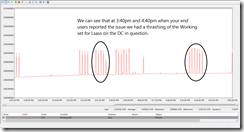
The third picture really tells the story. In this graph I had to scale the vertical axis values, because of the size of the value (Lsass was at 25GB for working set). Then I had to scale the data on to the new graph. Finally I had to zoom the vertical value in so that I could really see what was happening. I also played with the time window to zoom in on when the issue was happening. I sprinkled the magic dust to make it simple for management to understand picture. Of course this is not a complete analysis, but I wanted to illustrate the power and value of proper scaling.
In my next blog I am going to cover, horizontal graph scaling, auto scaling, and manually scaling.
Bruce
If you would like to know more about the course I mentions above follow the link below and see you Premier TAM to have it scheduled.
The Performance Monitor: Monitoring Vital Signs 3-day WorkshopPLUS course provides participants with the skills necessary to properly analyze and troubleshoot the overall health of the Windows server. This course reviews key performance counters that validate operating system and hardware health. Upon successful completion of this workshop, participants will understand how to use Performance Monitor, Server Performance Advisor, and Windows Reliability and Performance Monitor, and will be able to analyze environments running Windows Server 2003, Windows Server 2008, and Windows Vista.
You can also find a complete listing of Premier Proactive services at:
https://www.microsoft.com/microsoftservices/en/us/support_premier_proactive.aspx
In my next blog I am going to cover, horizontal graph scaling, auto scaling, and manually scaling.


