Presenting performance data to management
I am not going to talk about what counters to monitor or what their thresholds might be. There are blogs that do that and tools that can get you started. Below is a decent blog to get you started on what counters to analyze. The PAL tool has buried in its XML files the best current thinking on counter thresholds for Microsoft OS and products. The PAL tool does a good job at analyzing a performance counter logs.
Taking Your Server's Pulse https://technet.microsoft.com/en-us/magazine/2008.08.pulse.aspx?pr=blog
Performance Analysis of Logs (PAL) Tool https://pal.codeplex.com/
What I do want to talk about is how to present the data to management, so that they understand the data as well as the action you recommend to remediate the issue. It is important that your IT management understand why you recommend certain actions be taken. This also helps you professionally as it will show the value that you add to the company through your analysis.
Once you understand the counters to look at, their thresholds, and their relationships to other objects, it is easy to review the data. Presenting this data to management is another story. Management, for the most part, has limited technical skills as well as limited time. They are simply in a different role, so the goal of presenting performance data to management is to tell a story that will get them to understand why you recommend certain actions be taken. It is also important to do this concisely, as IT managers are constantly pulled in many different directions just like technical resources.
In the chart below what story do you feel I am trying to tell management?
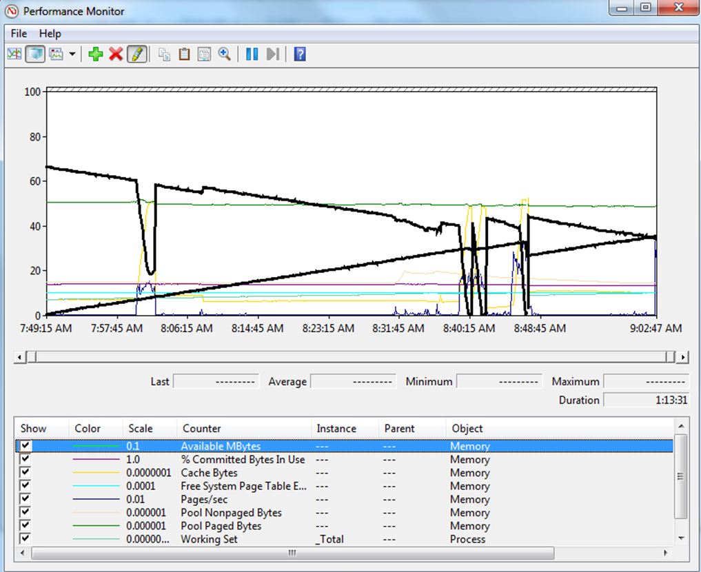
Trick question. I would not present the above chart to management. Here is why:
- There are too many counters on the chart! It would take lots of verbiage wrapped around this chart to explain what is happening.
- There are counters on the chart that have nothing to do with the problem or recommended action. Several of the counters on the chart I looked at to determine if they have crossed a threshold. Since they have not, they do not need to be present on chart.
- There are two counters highlighted in the chart but only one is shown in the scroll section. It is very difficult to write about a line that does not have a caption showing for it.
- There are counters in the chart that just confuse the story. For some reason, I cannot explain, management always seems to want to ask questions about the counters that have nothing to do with the story at hand. Especially if they see a spike in the counter.
This is how I would present the data to management. In the chart below what story do you feel I am trying to tell management?
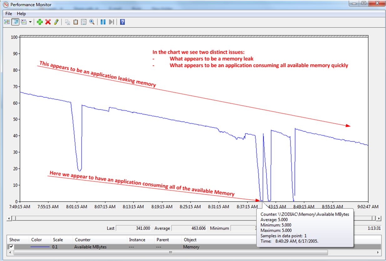
Normally below a picture I would have verbiage describing the picture and making a recommendation. In the above case I would talk about the application that is leaking and point them to another picture showing the leak. I would also talk about the application that is consuming all of the ram at once and point them to yet another picture confirming the case. You don't always have to have a solution to the problem, but at least narrow the scope and have next steps in terms of further troubleshooting.
My goal in the above chart is to have management agree there are two issues. Both issue having to do with memory depletion. So how did I do?
My advice below has been learned over time by making mistakes. Here is my general advice about sharing performance data with management is:
- Know what action you recommend, and make that very clear.
- Keep the chart you show management as simple as possible
- means only a few counters charted per picture.
- It might take several pictures to tell the story. Think Story board.
- If you place a counter in the chart it should enhance you story.
- Enhance the picture to tell your story. (Nobody is going to read the text, if the picture tells the story).
Here are my typical story lines:
- This system resources is being depleted
- This system resource has crossed the recommended threshold
- This this is the application that is consuming the resources
- This is the device that is consuming the resources
Once you have handed over the report it is out of your hands. You will have no control over who will see the report. Make sure it is easy to understand without you there explaining it.
Next I hope to write about scaling of counters. This is a very important skill to get correct. Without it you cannot tell the story correctly.
Bruce
Special Thanks! to LisaG for her collaboration.