Doing More With Less in Windows 8 Development -- (Part One)
Sonal Mane, a Startup Technologist working for Microsoft in Chicago, walks you through steps to make the Windows 8 app development process easier.
Here's her first post in a series.
Welcome to the 'Windows 8 design principles simplified' series. One of the key reasons for apps being rejected or sent back for fixes is Design.
Today's topic will be Do More with Less. It should give you a firm background on what reviewers look for in the app review process, and it will give you a premise with which you can begin your designing.
Designing for touch requires a few prerequisites that you would need to think through. Without these basics, you are not going to get too far.
1. Avoid distractions - The key idea is to trust you users and enable them to focus on where they are. Not where they need to go. As you approach design, focus on utilizing the real estate and what the app is great at. Clear the clutter and strip away everything that takes away from the app and your best-at statement.

2. Clearly define your best-at statement - To aid the decision-making around design, identify the single most important functionality that your app is best at. This means understanding your value prop and scope clearly and crystallizing it to a single statement. As you iterate on your app and add future versions, you can evolve and update your best-at statement. For your first iteration, keeping a narrow focus will help resolve several design decisions and issues.
3. Content over Chrome - Content is your best friend and the easiest way to get users excited about your app. High quality content also means you can draw attention without bells and whistles and attract users to your app. This means leaving only the most relevant user experience elements on the screen. This also means letting users immerse themselves in what they love and explore the rest. The thing to keep in mind is to flip the design mindset, think about solving to avoid distractions and not discoverability.
4. Clear out the Chrome - Chrome means navigation, layout, commanding and interaction. For example,
* Chrome comes from navigation, tabs and other navigational tools as they are used to help a user finding their way around an app.
* Chrome can come from layout that include boxes, rules and other content that is placed on the canvas to help organize content.
* Chrome comes from interaction and commands placed on the canvas to help users complete scenarios and features.
Simple rule to follow here is that if you see any user experience that helps with user navigation, layout and commands - Clear it out! Windows 8 has built-in design to help you work these elements into your app.
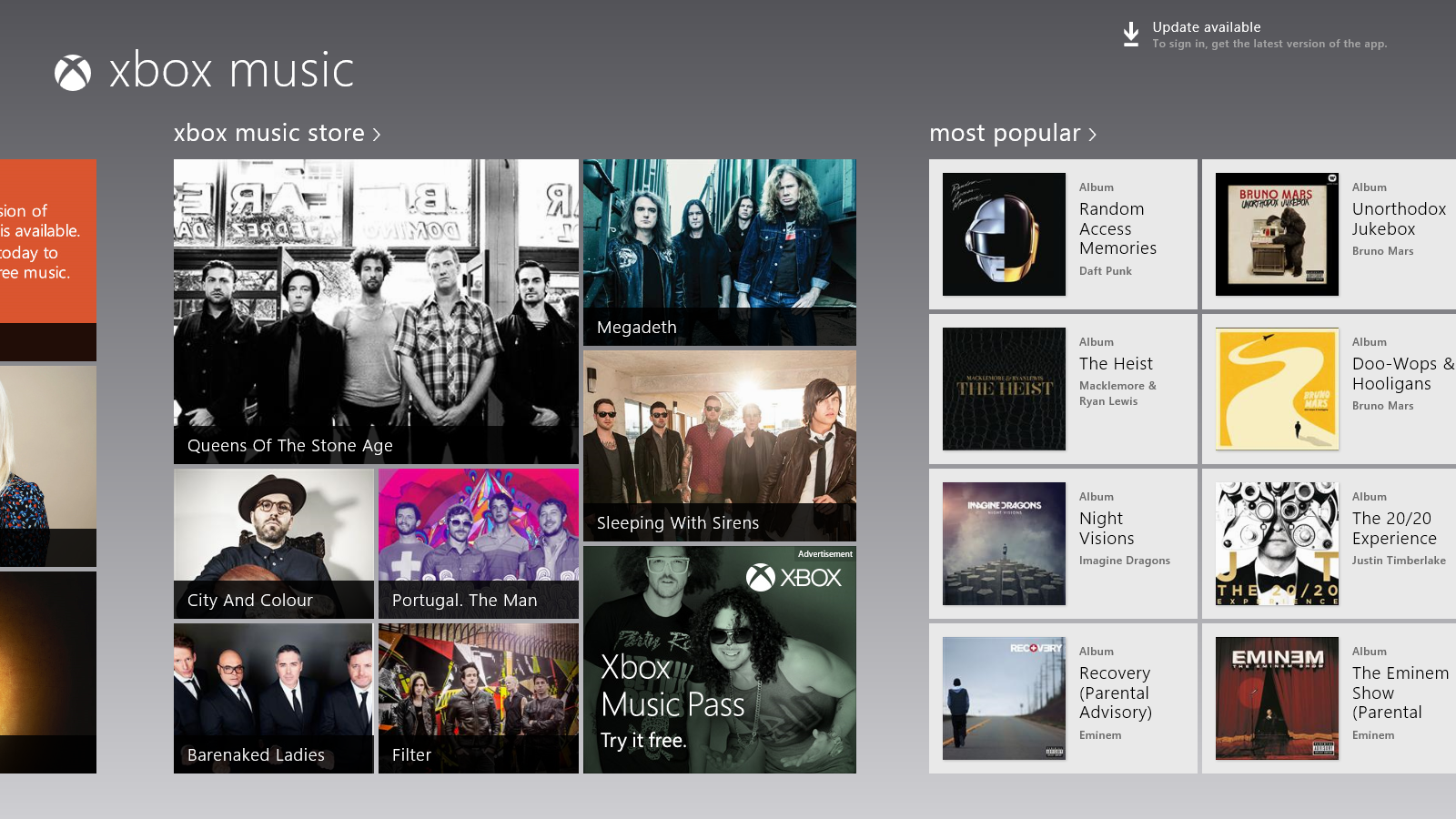
Here's a screenshot that focuses on the music video content and albums without cluttering the user experience with navigation, commands and layout.
5. Navigation, Layout and Commands Navigation - Pixels are precious so don't waste them on navigation. Sounds counter-intuitive when you focus on discoverability. Shift that focus on your content and think about where you are at and your content, not about the places where your user could go. When designing Windows Store apps, you can actually make the content itself navigable and remove this navigational chrome. Where does this navigation chrome go? It goes to the navigation bar from the top edge. Layout - Create visual clarity with crisp graphical elements. Remove lines and boxes to group and organize content. Give content breathing room through intentional use of space. This means that there is no need to draw lines around your groups. No need to draw arrows and create outlines on your user experience. Think space and not, boundaries. Commands - Integrate commands into the content. Leverage the edge. Provide commands contextually. Commands go in the app bar that shows up from the bottom edge. The content itself is interactive so your images headlines, titles and content can be tapped on to navigate to something. Search, Share, Settings and Devices go in the Charms that show up from the right edge. Login goes into right edge on the right sidebar.
How do users see these hidden navigation and app bars and charms ? The app should pop the relevant user experience based on context. For e.g. when a user selects multiple images, that is an indication to pop the command bar. Guess what, the user is about to perform an action on these images.
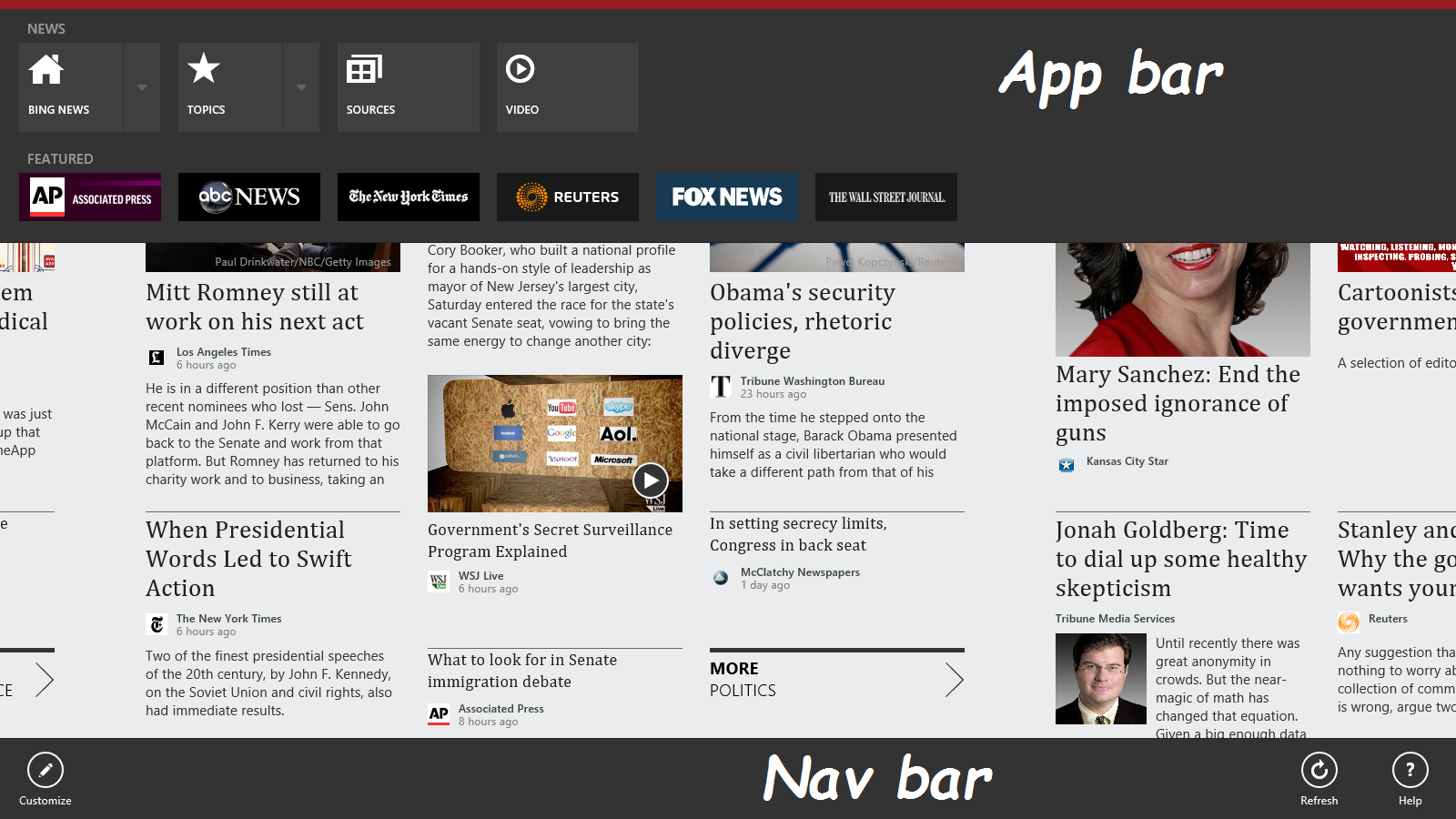
Here's a screenshot of what the navigation and app bar look like.
Want to dive deeper into this topic? Check out the video on Do more with less for more details.