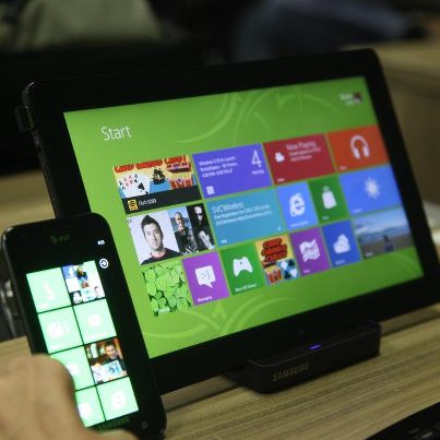
Alive with Activity -- Touch First Experience and Simplicity of Design
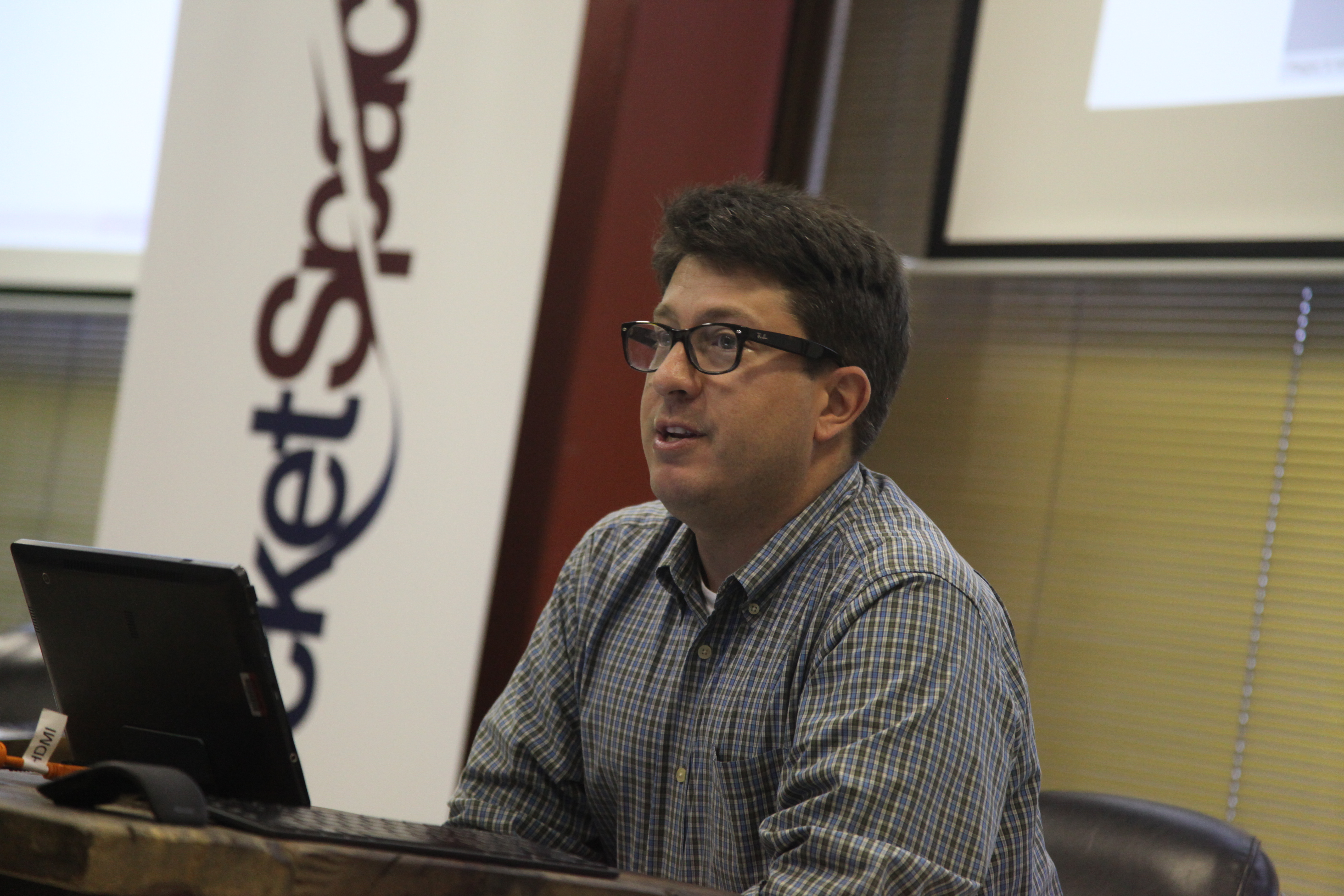
I went to RocketSpace last night where Michael Scherotter, principal architecture evangelist for Microsoft gave a pretty interesting talk about the simplicity of the windows 8 design.
He started by pointing out the Bauhaus chair he was sitting in and showing that there is nothing extraneoius about the design. He evoked the work of architect Mies van der Rohe, one of the early leaders of the Bauhaus design school in the 1930s.
It's a marriage of form and function which takes away all distraction and just makes the experience of sitting in the chair a pleasurable one. A tablet interface -- at least this is what I thought Michael was saying -- is a place where that same kind of Windows 8 experience gets played out.
When Michael talked about how this same kind of thinking went into the Windows 8 interface, it began to get interesting. He said that looking at the screen, it is very clear that there are some things that fingers are good at doing, and there are some things that the mouse is good at doing. His suggestion to app developers was to pay attention to the meaning created by each of these types of movements. I had not heard a developer / designer talk about these things so I wrote some of these things.
The main focus in developing Windows 8, from the customer trials and focus groups to the reease of the preview last week, is on putting "content before Chrome." Chrome is not the Google web browser. Chrome is the extraneous. He looked around RocketSpace and said, "You notice there are no cornices. There is no artifice" around the room. "all that has been taken out." RocketSpace is an old loft warehouse. It's just bricks, industrial lighting, some ceiling tiles and space to work.
There is no "chrome" in the architecture. "Everything is functional." Where there is functional design, there is room for intimacy, for thinking, and for intentions. There is a purity in the straight and formal utilitarian design. It's quite thrilling.
He went on to say that the new interface was made to be Touchfirst, where people could easily read what can be done with the fingers, and easily move from one thing to the next and make some kind of meaning out of their experience. I really liked this. I think it suggests a fundamental shift for Windows technology and Microsoft thinking. Yes, other companies have done touchscreen. But to see this powerful shift to something that was just about the desktop and only about the mouse and keyboard to something that is about -- for mobile-heavy users like me -- something about the inherent intimacy between touch and wants, or touch and intention, is really powerful.

