GridView & Multiple Item Templates
Ever wondered how to have a GridView with multiple layouts/sizes for its items.
I see some apps using the Windows 8 Grid project template, and never change how items would look, which might give a sense of boredom of having the same even
square look everywhere.
The goal of this post is to learn how to change the following

fig.1
Into the following:

(The colors are used to highlight the change)
Let’s walkthrough it step by step. I’ll be using Visual Studio 2013, and XAML/C#
The project is attached, so please forgive me for the code screenshots :)
1- Create a new Windows Store Project from the Grid project template.
2- Go ahead and run the project, you will find the application starts to the main page (GroupedItemsPage.xaml in our case), and you will see a similar layout to fig.1
3- Let’s inspect the XAML in the GroupedItemsPage, you’ll find the DataTemplate used to layout the item is defined inside the GridView as seen in the next fig.

4- First thing to do and as a recommended practice, extract the DataTempate outside of the GridView definition. You have the option to have it defined at the page level (inside the <Page.Resources> tag.) or on the App level in Resources Dictionary file.
5- In the first case, you’d give it a name (x:Name=”…”) and then set the GridView’s ItemTemplate property to it. In the later case you’ll need to define the ResourceDictionary file in the App.XAML, we’ll explain this later.
6- Currently, I’ll use the first approach, so I called it “HomeDataTemplate”, and I’ve moved the height property from the first text box to its container StackPanel, just an optional step for my own preference.


7- Please run the app and you should get the same layout as before, nothing should be changed.
8- Let’s define two new data templates just under the HomeDataTemplate definition. We can copy from the HomeDataTemplate.
9- Name the first one “HomeWideDataTemplate”. We want this to be as wide as 2 originally displayed items, and since the original data template has a width of 250, and considering the 10px spacing between items, this one should have 510 width, while we are at it, I’ve removed the image from the border tag, and changed the background to be Red.
10- I’d name the second template “HomeLongDataTemplate”, and set its height to 510, and the background to Yellow.

11- Now we need to use a class to select which data template to use for which item. The class should derive from DataTemplateSelector, it should have public properties, one for each data template and their type should be DataTemplate (no wonder). Then you’ll need to override one of the 2 SelectTemplateCore overloads, in which you should have some logic to return any of the DataTemplate properties, here is an implementation.

12- Now there is nothing tying this class to the XAML templates, and nothing is tying it to the GridView. For this we define an object of this class in the <Page.Resources> of the page in hand, and set each of its dataTemplale properties to those properties defined in the same page (the ones we need to use). Also we need to remove the ItemTemplate property setting from the GridView and add a setting for the ItemTemplateSelector

13- Now if you run the app, you will see a change but not the final product you wish to see.

14- What happens here is that, the first item (the wide one), has set the default cell dimension of each item. We need to change that to have each item occupy different dimensions.
For this we’ll assume that the original item size is the cell default dimension, and that we need the wide item to occupy 2 cells horizontally (span 2 columns), and the long item to span 2 rows.
To implement this first we need to change the internal Grid used in the GridView to use VariableSizedWrapGrid in 2 positions as follows.

15- Notice that, in the GroupStyle.Panel, you need to set the ItemWidth & ItemHeight properties to the desired cell size (don't confuse them with the Width & Height properties), also you need to set a right margin if you want to separate between groups.
16- Then you’ll need to modify the selector class to ask for column & row spans for the UIElement where appropriate.

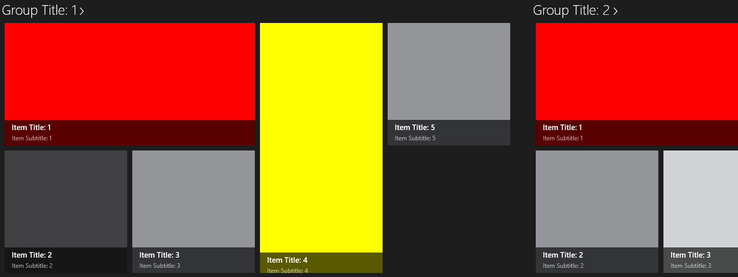
The result should be like the following
Final Notes:
- The template Selector class, can be reused at different pages, provided that you will need a wide template that spans 2 columns, and another that spans 2 rows, and so you’ll just need to create an object from it, and provide the templates to be used.
- You can have whatever logic you’d like inside the selector class to select which template to return. This can depend on the data item properties, or can just depend on the order/index of the item being served. In the later case you might use a counter member on the class.
(Edited on 2/28/2014)
Let's try to use the same TemplateSelector Class in the GroupDetailPage.
We need to convert the following layout:

To the following layout:

Using an object of the selector class we can have a wide item and another long one according to the same logic that was set in the class.
The only difference here is that this grid doesn't have groups, so we'd need to set the ItemHeight and ItemWidth in the ItemsPanelTemplate.
Please note that the margins have been taken into consideration when determining the cell dimension.

** There remains one question which I'm looking for its answer.
Take a good look at the GroupedItemsPage, you will notice that Groups with fewer items will still occupy the same width as does the first Group.
i,e, The first group sets the default, and there must be a way to auto set the width.
If you have the answer please share it in the comments.