On-demand metric aggregation and visualization in OMS
Summary: Perform on-demand aggregation on any metric data and visualize it in Microsoft Operations Management Suite.
Hi everyone. Leyla Kazemi here, and today I want to talk about a new functionality in OMS that helps you perform on-the-fly aggregation on your metric data, and visualize across multiple vectors, which makes troubleshooting much easier.
On-demand metric aggregation over time
Let’s start with performance counters in OMS. To enable and visualize performance counters in OMS, see:
- Add counters to near real-time performance data collection in OMS
- Use OMS Search to visualize collected performance data
With near real-time performance data collection, you can collect and visualize any performance counter in OMS. Simply entering the query Type:Perf will return thousands of metric graphs based on the number of counters and servers in your OMS environment. With on-demand metric aggregation, you can look at the overall metrics in your environment at a high level, and deep dive into more granular data as you need to.
Let’s say that you want to know what is the average CPU across all your computers. Looking at the average CPU for every computer might not be helpful because results may get smoothed out. To look into more details, you can aggregate your result in a smaller time window chunks, and look into a time series across different dimensions. For example, you can perform the hourly average of CPU usage across all your computers as follows:
Type:Perf CounterName="% Processor Time" InstanceName="_Total" | measure avg(CounterValue) by Computer Interval 1HOUR
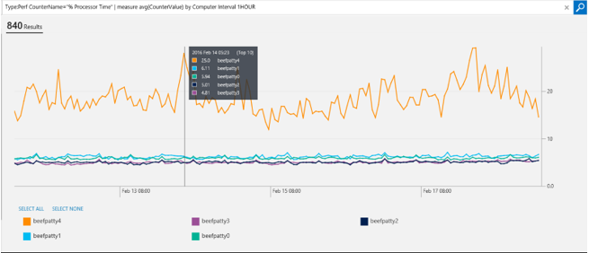
This helps in several ways. First, you can easily compare across multiple computers which ones are having issues. Second, for each computer you can find at which time interval the computer was facing a problem (for example, a CPU spike). Therefore, you can look at several issues in one glance to help you troubleshoot easier.
The graph is also interactive. You can zoom in to the areas where you are more interested by clicking the graph and dragging it.
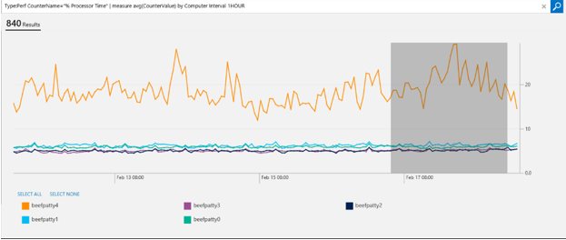
After you zoom in, clicking Reset Zoom will bring back the original visualization.
You can also hide the noisy charts if there are too many in one graph. All you need to do is click the legends you don’t want to see and they disappear from the graph.
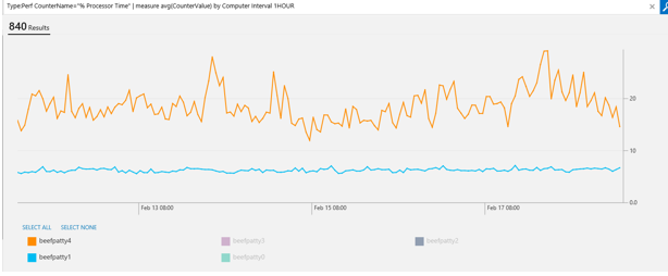
Clicking the legends that correspond to the disappeared charts toggles them back.
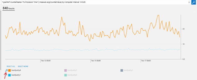
If you want to drill in to all the results for a specific chart (in this example, computer), you can click the search icon next to the legend, and it will take you to all the results for that.
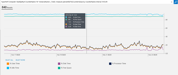
You can also group by other fields. In this example, I’m looking at all the % counters for one specific computer, and I want to know what is the hourly 70 percentiles of every counter:
Type:Perf Computer=beefpatty4 CounterName=%* InstanceName=_Total | measure percentile70(CounterValue) by CounterName Interval 1HOUR
One thing to note is that these queries are not limited to performance counters. You can apply them to any metric. In this example, I’m looking at W3C IIS logs. I want to know what is the maximum time it takes over a 5-minute interval for processing each request:
Type:W3CIISLog | measure max(TimeTaken) by csMethod Interval 5MINUTES
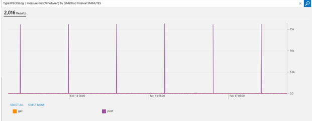
This shows that I’m seeing a consistent spike in the last seven days for my post requests taking more than 10 seconds, which helps me drill down more to see why that is happening.
Multiple on-demand metric aggregation over time
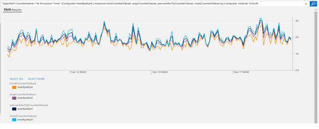
You can also specify multiple aggregate functions in one command. In the previous queries, suppose you identified which computer was having a higher CPU usage. You can drill down to that specific computer and look at the hourly average, minimum, maximum, and 75-percentile CPU usage for a specific computer:
Type:Perf CounterName="% Processor Time" InstanceName="_Total" (Computer=beefpatty4) | measure min(CounterValue), avg(CounterValue), percentile75(CounterValue), max(CounterValue) by Computer Interval 1HOUR
Dashboard views
If you make a cool visualization and you want to keep it, you can save it in My Dashboard. All you need to do is to save the query, go to My Dashboard, and create a tile for it. If you drag the tile, it selects a bar chart by default. However, you can edit the tile, and choose a line chart.
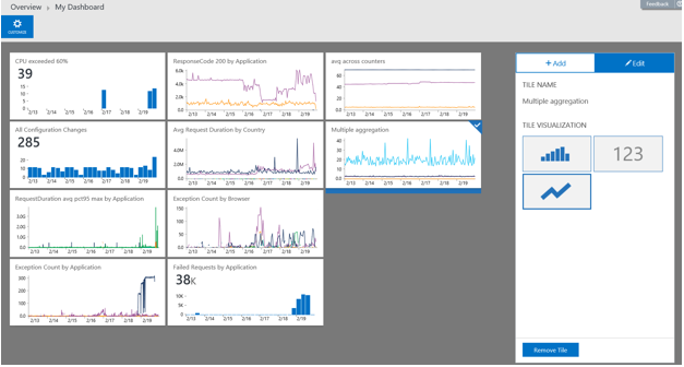
Now you can keep an eye on things you care more about.
Alerts
You can also set alerts for these queries so you get notified when things go bad. For example, in the previous IIS log, you want to be notified if the average time (in the 5-minute interval) for processing each request exceeds 2 seconds. This query will generate an alert for you:
Type:W3CIISLog | measure avg(TimeTaken) by csMethod Interval 5MINUTES | where AggregatedValue > 2000
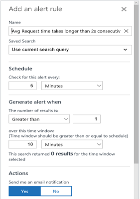
Let’s say you don’t care if this happens once, but you do care if it happens twice consecutively. Here’s how you create an alert so next time you can proactively take action:
That is all I have for you today. Join us next time when we’ll talk about what’s coming with metrics in OMS.
Leyla Kazemi
Microsoft Operations Management Team